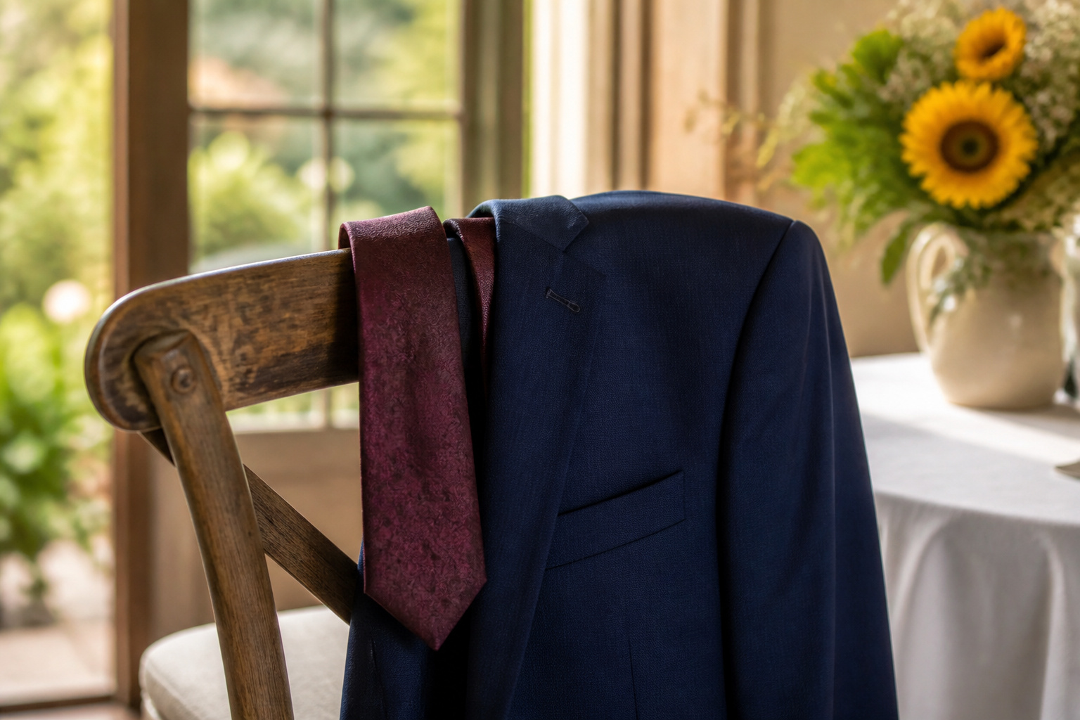
A navy suit at a wedding calls for a tie that reads intentional without shouting across the ceremony aisle. The right color depends on whether you want soft contrast, tonal sleekness, or something bolder like burgundy or forest green.
Powder blue is the safest wedding choice; it separates you from every other navy suit in the crowd without breaking formality.
Blue Ties
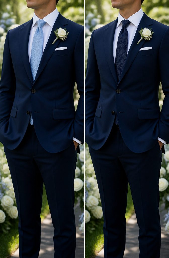
A powder blue or steel blue tie against a navy suit gives the soft contrast most wedding guests are after. The lighter shade reads intentional without shouting for attention across a ceremony aisle.
I have seen this pairing hold up in both afternoon garden receptions and dimly lit evening ballrooms; the tone stays legible where a pale gray might wash out.
For a sleeker route, a navy tie matched to the suit itself creates a tonal column that photographs cleanly and works especially well when the groom wants the boutonniere or pocket square to carry the color.
The risk here is flatness, so texture matters more than with a contrasting shade. A navy solid with subtle weave, a blue pencil stripe, or a restrained blue plaid keeps the look from reading like a forgotten accessory.
Between the two, the lighter blue is the safer wedding choice. It separates you from every other navy suit in the crowd without breaking the formality of the occasion.
The tonal navy suit-and-tie pairing wins only when the rest of the outfit, shirt, and accessories are deliberately layered in to add dimension.

High quality and soft texture, it is comfortable to wear and to touch.

Material: Made of Premium Microfiber. Touch Finer, Soft & Easy care.

High quality and soft texture, it is comfortable touch.1200 careful stitches make your necktie heavy weighted and elastic.
Burgundy and Red Ties
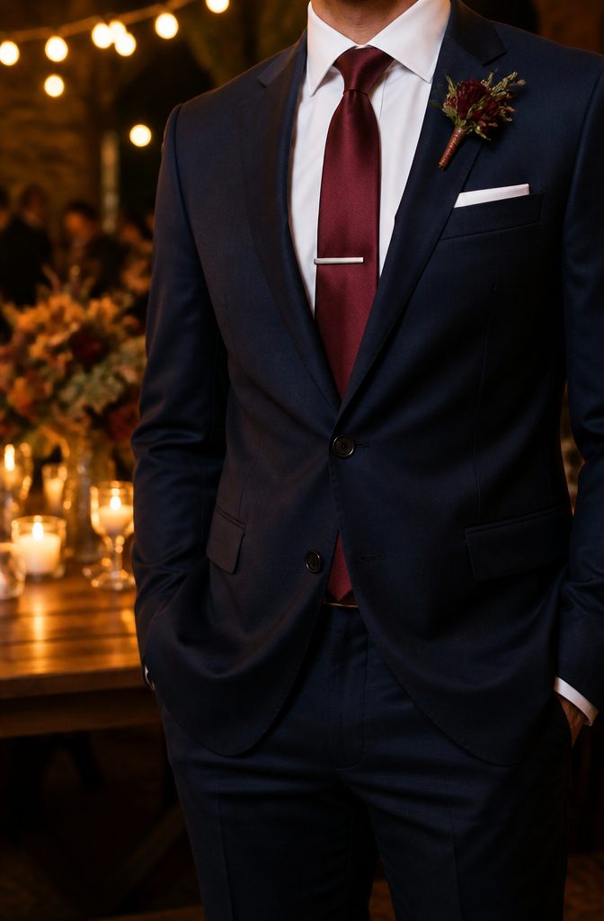
A burgundy tie with navy suit wedding pairing carries warmth that flatters the cool undertone of the fabric without drifting into costume territory.
The depth of the shade reads as confident rather than loud, which is why it works across formal ceremonies and evening receptions alike.
Silk in this color especially catches light in a way that feels grounded and composed, not flashy. For variation, a tone-on-tone stripe or a paisley pattern keeps the same richness while adding texture.
Solid burgundy remains the safer bet if the rest of the outfit already carries pattern, but either route preserves that bold yet classic contrast the combination is known for.
Deep red sits adjacent to burgundy on the same spectrum and behaves similarly, though it leans slightly more assertive.
In a wedding context, that extra push of color can suit a groom who wants to stand apart from groomsmen in more muted ties, or it can anchor a winter palette where stronger hues feel at home.
The finish matters: matte wool reads casual, while a refined silk or subtle sheen keeps it event-appropriate.
The risk here is choosing a red that drifts too bright or too orange, which can tip from contrast into clash against navy’s steadiness. Holding to deeper, wine-adjacent tones protects against that.

High quality and soft texture, it is comfortable to wear and to touch.

Material: jacquard woven satin polyester, texture is silky smooth soft.

Including 1 Necktie + 1 Gift Box. Neckties Size: 3.15” (8cm) wide and 58” (147cm) long.
Silver and Gray Ties
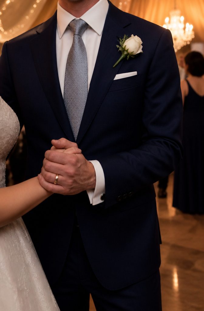
Silver and gray ties are the quiet workhorses of wedding formalwear. A solid silver tie, a silver gingham plaid, or a subtle gray pattern turns a navy suit into something polished without shouting for attention.
These are the shades to reach for when the reception runs into evening and the lighting drops; they hold their tone instead of flattening out the way bolder colors can.
The monochrome pairing reads as intentional, not safe by default. Gray keeps the focus on the suit itself while adding just enough texture to keep the look from reading flat.
That restraint photographs cleanly, too; the eye goes to the couple, not the neckwear. For a black-tie optional call or any wedding where understated elegance is the brief, this palette delivers without needing to explain itself.

CALVIN KLEIN STYLE: Upgrade your accessory collection with the standard Woven Gingham pattern men's tie from Calvin Klein. The classic design can effortlessly add a refined look to your formal or semi-formal attire.

【Purchase Contains】1 Necktie+ 1 Matching Pocket Square + 1 Pair of Cufflinks+ Gift Box

Classic and Elegant Tie Design:This tie measures 3.15 inches (8 cm) in width and 58 inches (148 cm) in length. Made from high-quality fabric, it features a soft texture and a luxurious sheen, perfect for adding a touch of sophistication to any formal occasion.
Purple and Lavender Ties
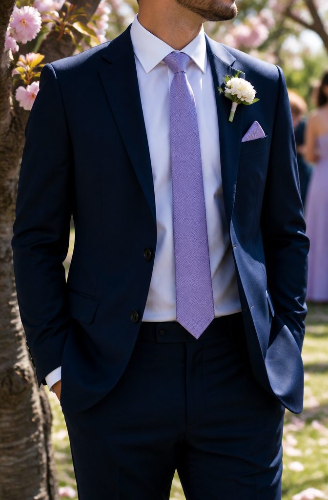
Purple and lavender ties hit a rare middle ground: they read as bold without stealing attention from the navy suit itself.
A lavender solid keeps the look quiet enough for a ceremony, while a purple paisley or soft purple pattern shifts the same combination toward a spring reception where the light is brighter and the mood looser.
I have seen this pairing read as creative rather than costume-y only when the shade stays muted, never saturated.
For a wedding with a mid-morning start, a lavender tie against navy reads fresh; for evening, a deeper purple with a small repeating pattern holds the same sophistication without disappearing into the dim light.
The risk is choosing a shade too close to true violet, which fights the cool undertone of most navy cloth rather than complementing it. Stick to the dusty end of the range, and the color does the work for you.

Special Promo: Available for orders of 5+ pcs or 10+ pcs.

Including 1 Burgundy Necktie + 1 Packing Box. The vibrant burgundy hue pairs perfectly with a variety of suit colors, including light gray, navy, or classic black, making it a versatile addition to your necktie collection.
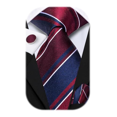
【Purchase Contains】: Silk Self Tie * 1+ Matching Pocket Square * 1 + Matching Cufflink * 2 + Gift Box,easy matching for all dress shirt and suit
Pink Ties
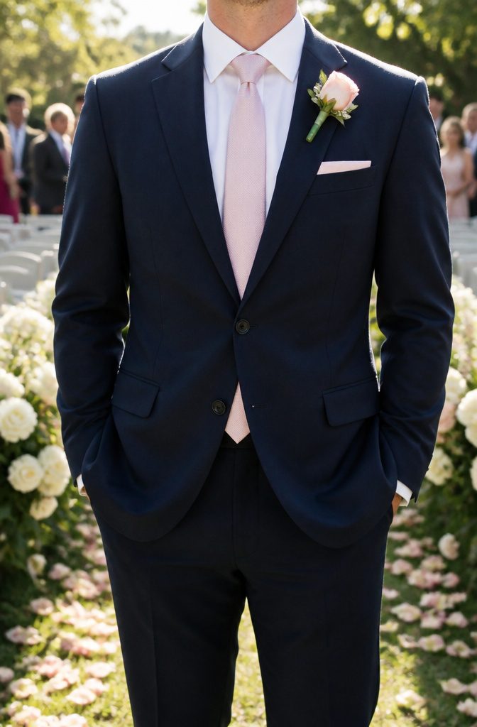
Soft pink ties read as modern and approachable against a navy suit, especially at spring and summer weddings where the lighter palette feels at home outdoors.
A light pink solid keeps the look clean for more traditional ceremonies, while paisley or floral patterns add charm without drifting into costume territory.
Bright pinks make a bolder statement and work best when the dress code leans casual or the groom wants to stand apart from the wedding party.
The same pink that looks fresh and intentional at a garden wedding can feel slightly off at a black-tie evening affair, so the season and time of day matter as much as the shade itself.
For a 5 p.m. church ceremony followed by a ballroom reception, a muted blush reads safer than a saturated fuchsia.
Family guests tend to interpret softer pinks as classic with a twist; younger crowds or creative fields often welcome the brighter end of the range.

Solid Color Ties Size:3.4 in. wide x 59 in. long (8.6 × 150 cm); Mens wedding business tie set come with exquisite box for a variety of dress shirts and suit tuxedo

Size Ties: 3.4 in wide, 59 in long; Pocket Square 12 in 12 in; Mens wedding business tie set come with exquisite box for a variety of dress shirts and suit tuxedo

Ties Size:3.4 '' × 59 '' (8.5 cm × 150 cm); Handkerchief : 12'' x 12 '' (31 cm x 31 cm); Ties set come in well packaging with 1 Tie + 1 Pocket Square + 1 Pair Cufflinks
Green Ties
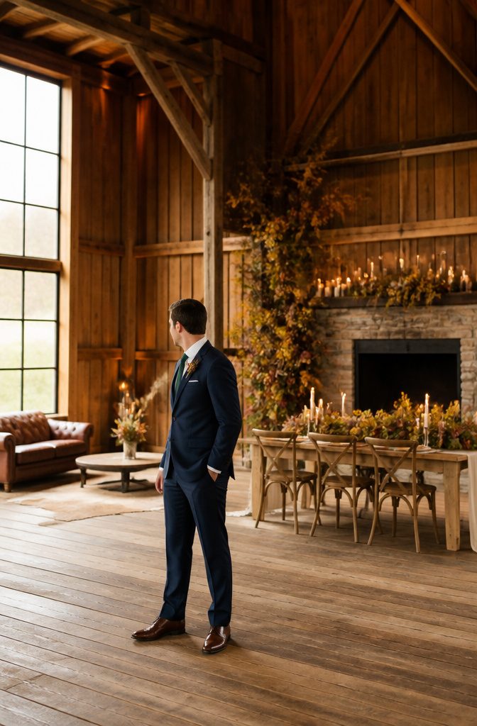
Deep greens like hunter green or jewel tones such as oasis sit against navy with a quiet confidence that reads refined rather than loud.
I would not reach for olive or sage in a formal wedding setting; those tones belong to casual or creative environments where the dress code loosens up.
Fall and winter weddings are where forest and hunter green ties earn their place, pairing naturally with the heavier textures wool suits bring in cooler months.
Summer calls for lighter materials, so a muted green in linen blend or lightweight silk keeps the look sharp without the visual weight.
The risk with green is that it demands more thought than blue or burgundy: a neutral shirt and restrained accessories are non-negotiable, or the whole thing tips from personality into noise.
For a groom or guest wanting something modern and slightly unexpected against navy, green works when the confidence is there to wear it without apology.

Material:jacquard woven silk blend, texture is silky smooth soft.

Tie Set for Men: A navy blue necktie with pocket square set, elevate your style with this sophisticated checkered tie set; The subtle criss cross plaid pattern adds a touch of elegance; Stand out from the crowd with this versatile accessory that strikes the balance between refinement and versatility

Material: jacquard woven satin polyester, texture is silky smooth soft.
Gold and Yellow Ties
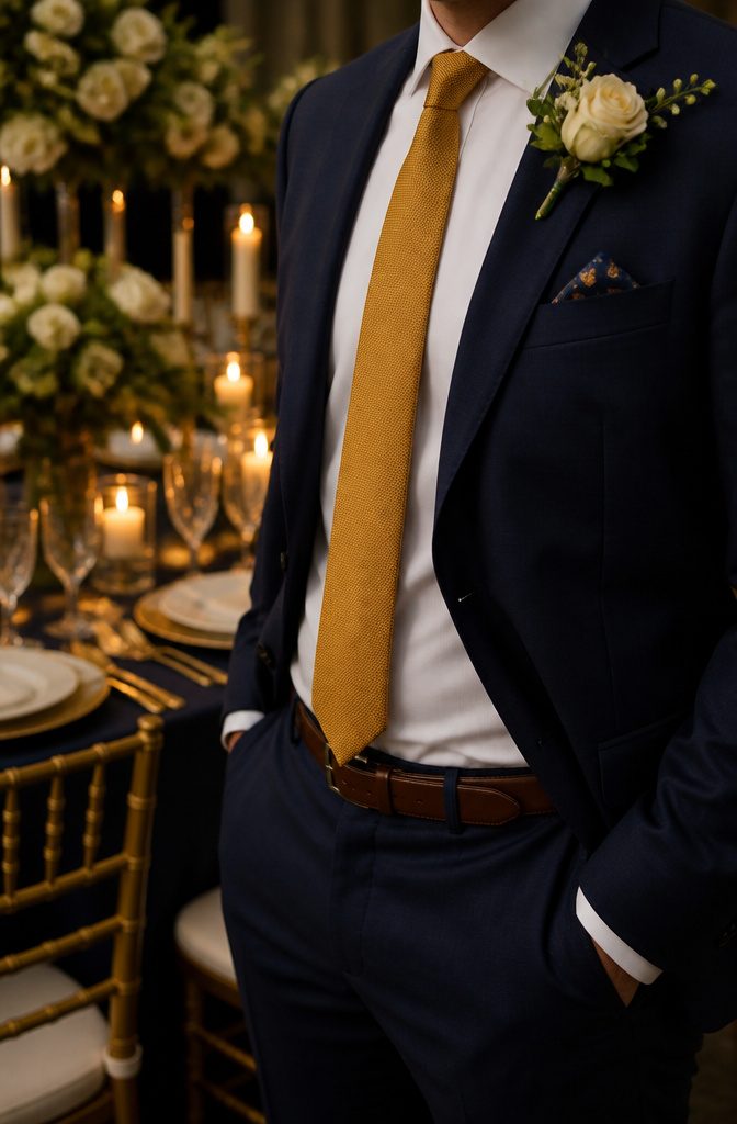
A gold or mustard tie brings warmth to a navy suit without shouting for attention.
Softer shades read as sophisticated; bright yellow, by contrast, tends to jolt the eye and can feel out of place at a wedding where the couple is meant to draw the focus.
I learned this the hard way at a summer ceremony where a groomsman showed up in a near-neon shade that photographed like a caution sign against the navy.
Gold tones suit evening events and festive occasions best, catching candlelight in a way that flatters without competing.
They also bridge the gap between formal and celebratory: a muted mustard works for an autumn barn wedding, while a deeper antique gold fits a winter hotel ballroom.
The common thread is the subdued finish. If the tie looks like it could sit comfortably in a dimly lit room, it probably belongs there.

Special Promo: Available for orders of 5+ pcs or 10+ pcs.

High quality and soft texture, it is comfortable to wear and to touch.

Brown Ties
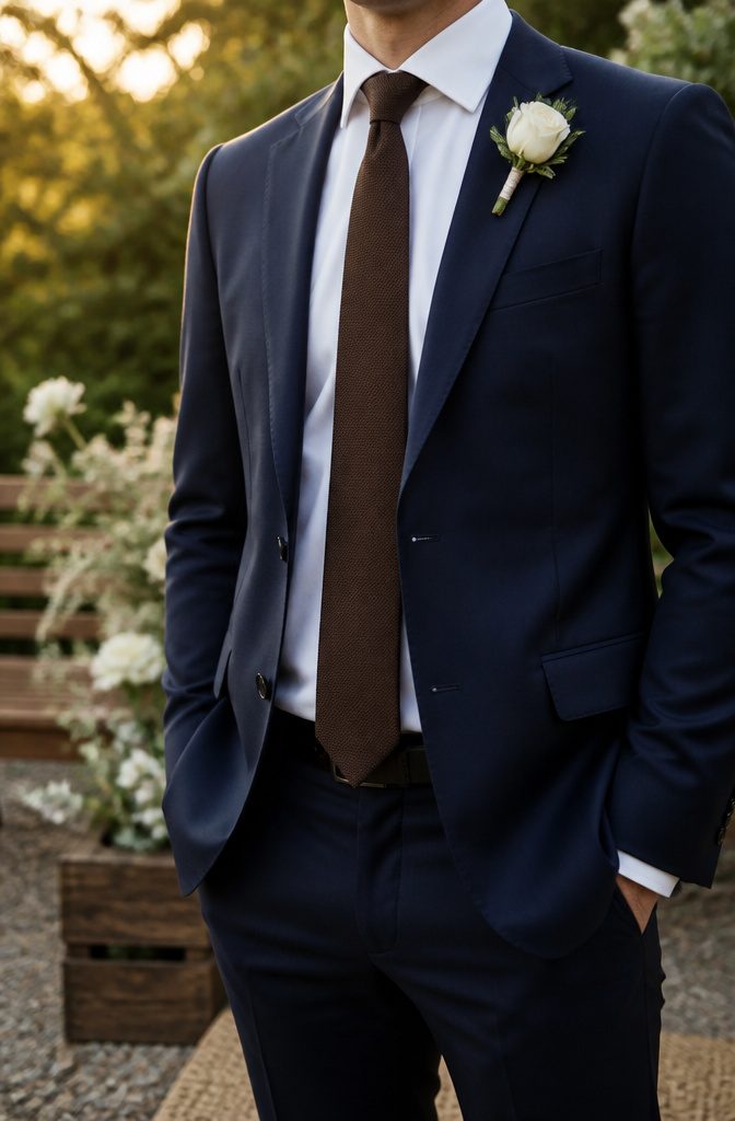
A brown tie against navy reads as grounded rather than flashy, which is why it works for a wedding that still has to feel like an occasion.
Darker shades like truffle or chocolate give the most refined result; they sit close enough to the suit’s depth to look intentional, not like a leftover office choice.
Lighter browns, tan or champagne, introduce warmth and a clearer contrast against the blue, though they tilt more casual and can feel underdressed for an evening ceremony.
The pairing is less expected than red or blue, but that is the point.
It projects a sharp, professional appearance without borrowing from the groom’s typical palette, which matters if you are a guest who needs to look polished but not competitive.
For a daytime wedding with business-dress undertones, a chocolate brown in silk or a subtle texture hits the same formal register as a mid-tone gray, just with more personality.

[Package Include] 1 self-tied necktie(3.15x59inch/8x150cm), and 1 pocket square(9.45x9.45inch/24x24cm)

Set--1*Necktie,1*Handkerchief,1 Pair*Cufflinks;1*Black Gift Box

You can get: Include 1 Necktie+1 Pocket Square + A pair of Cufflinks+ gift box.The pattern and fabric of the tie set remain consistent, solving the matching problem for you.
Black Ties
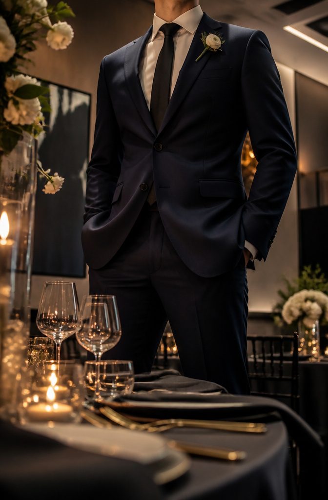
A black tie with a navy suit reads formal and deliberate, but the pairing can feel flat in daylight or at an outdoor wedding where other guests are wearing color.
Reserve solid black or a lightly striped black tie for evening ceremonies and receptions where the lighting does the work of creating contrast.
In those settings, the look is sleek and understated, the kind of subtle elegance that does not compete with the couple.
For a daytime event or a wedding with a more relaxed dress code, the same combination can look like you grabbed the first tie in the drawer.
If your date is wearing a black dress, the monochrome line between your navy suit and black tie creates a coordinated, intentional silhouette.
That context is where black ties earn their place; outside of it, the safer move is almost anything with more warmth or texture.

Standard Classic Size - Necktie: 3.35 '' × 59 '' (8.5cm × 150cm); Handkerchief: 12 '' x 12 '' (31cm x 31cm); Ties and pocket squares come in good packaging and make wonderful presents for birthdays and Christmas.

Flattering Shape: Waist ruching helps create a smoother, more flattering silhouette while enhancing natural curves with a comfortable fit

①Perfect collocation:Necktie+handkerchief+cufflinks, easy-matching for all dress shirt and suit!
Orange Ties
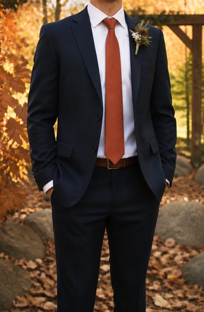
Burnt orange and rust tones read as surprisingly sophisticated against navy when you keep them muted.
A persimmon shade warms the whole outfit without shouting across the room, and the pairing earns its place mostly at autumn weddings where the palette already leans toward harvest colors.
The line between stylish and costume is thin here. Soft, subtle orange shades hold the balance; anything neon or saturated tips the look toward novelty.
Patterns help, but they need the same restraint: a quiet texture or micro-dot carries the color without turning the tie into a statement piece that fights the suit.
I would skip this combination entirely for a spring or summer wedding. The seasonal logic matters with orange more than with safer neutrals, and wearing it outside its natural window looks forced.
If the wedding runs October through early November and the bridesmaids are in burgundy or forest tones, a rust tie threads the groom or groomsmen into that story without matching too neatly.
Stick to matte wools or knitted textures rather than glossy silks; the slight roughness keeps the color grounded.

4PCS Tie Set Including:Necktie+Pocket Square+Lapel Pin+Tie Clip.Neck Tie Size:3.15 inches (8cm) wide and 58 inches(148cm) long; Pocket Square:9.85*9.85 inches (25*25cm);Tie Clip: 2.36inches(6cm);Lapel Pin:3.35inches(8.5cm)

①Perfect collocation:Necktie+handkerchief+cufflinks, easy-matching for all dress shirt and suit!

Purchase Includes: Necktie*1+Handkerchief*1+A pair of Cufflinks*1+Silver tie clip *1+Flower Lapel Pin*1
Patterns and Textures
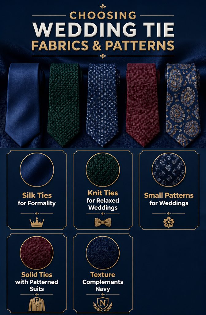
Silk ties carry the weight a wedding asks for. The fabric catches light differently than anything else, and against navy it reads celebration, not conference room.
I reach for silk first when the event is formal, though a knit tie in hunter green or burgundy has its place at a more relaxed wedding where texture matters more than polish.
Stripes and paisley can add depth, but small-scale patterns read wedding-appropriate while bold stripes feel borrowed from a business meeting.
The scale is what separates them. A floral or retro paisley tie brings personality without the corporate association, and that spark works especially well against dark navy.
If the suit itself carries pattern, like pinstripes or windowpane checks, a solid tie is usually the smarter move. Competing patterns fight for attention, and the suit should lead.
Subtle texture on an otherwise plain tie, a slight weave variation, can add interest without starting that fight. The goal is complement, not competition.
Seasonal Tie Choices
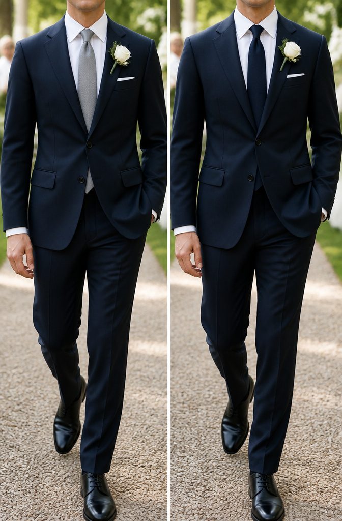
Spring and summer weddings call for lighter ties in muted greens or slate tones, usually in linen blends or lightweight silk that won’t weigh down the look when the heat climbs.
I learned this the hard way at a July outdoor ceremony where a wool-blend tie I had chosen left me looking overdressed and feeling overheated in every group photo.
Breathable, non-shiny fabrics photograph better in bright natural light anyway; they catch the sun evenly instead of throwing back hard highlights that the camera reads as cheap.
Fall and winter flip the equation.
Deeper burgundy, charcoal, or forest green ties against a navy suit gain richness from the lower, slanted light of cooler months, and the heavier wool or textured weaves that feel right with winter suits actually help the tie hold its shape for portraits.
The seasonal shift matters more than most grooms budget for: a summer-weight tie in December looks thin and slightly apologetic in formal photos, while a dense winter tie in August reads as stubbornness against the weather.
Match the tone to the temperature, and the camera usually follows.
Accessories That Complete the Look
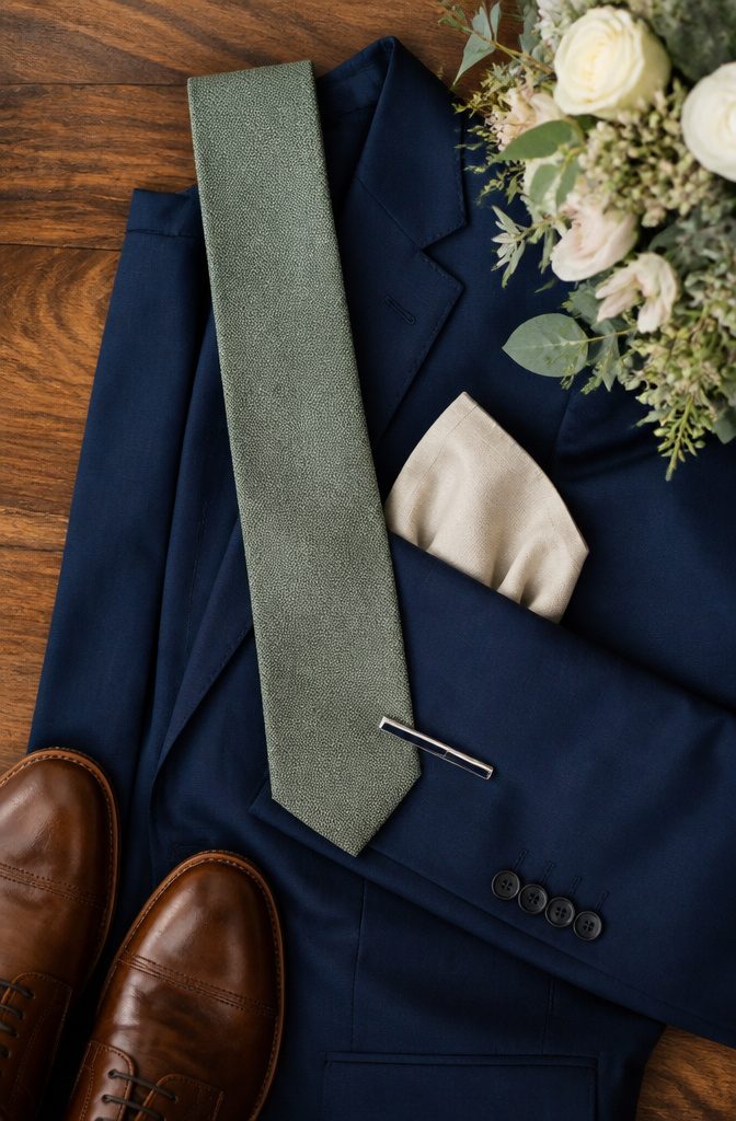
A pocket square should never match your tie exactly. The point is contrast, not replication: if the tie is solid, the square picks up a secondary color from it, or vice versa.
At my own wedding, the groomsmen wore burgundy knit ties and white squares with a thin burgundy border; the echo was enough to look intentional without looking like a set bought from a discount bin.
Tie bars belong between the third and fourth buttons, never lower, and they should never be wider than the tie itself.
Silver reads more modern, gold warmer; either works across most colors. The bar is functional first, keeping the tie clear of soup and champagne, so skip it if your jacket stays buttoned the entire reception.
For a wedding under $10K, these details are where rental packages often cut corners. Buying a $15 tie bar and a $12 pocket square outright beats the "upgrade" fee most rental houses charge for anything beyond the basic satin.
The hardware travels; you wear it again. The math is simple once you stop treating accessories as afterthoughts.
Colors to Skip
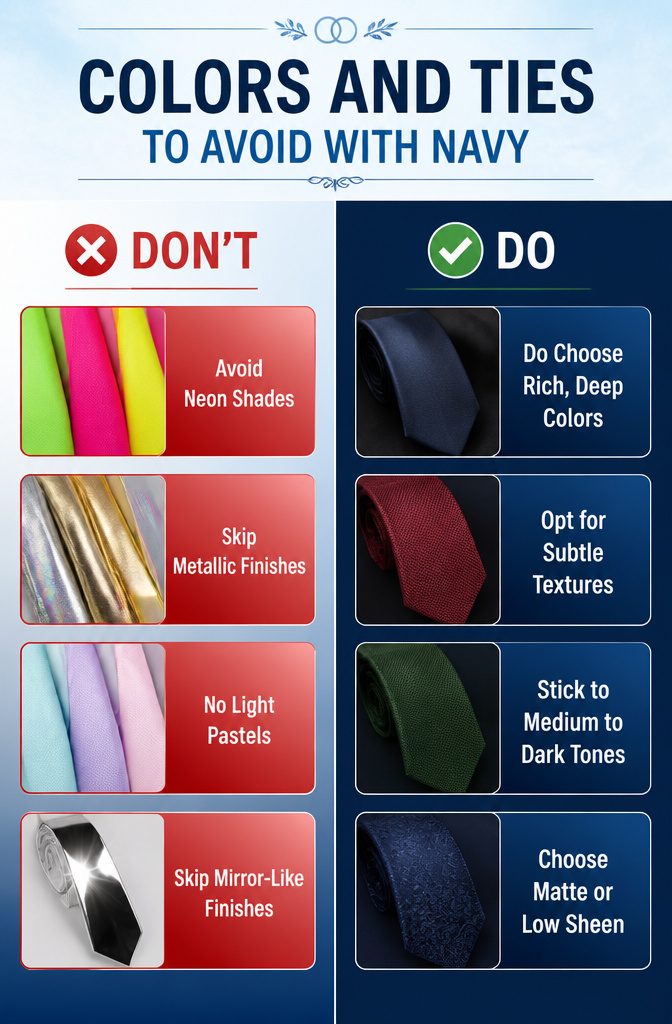
Neon shades and ties with a mirror-like finish are the two mistakes that stand out most against navy in wedding photos. Electric greens, hot pinks, and highlighter yellows fight the suit instead of complementing it.
The camera picks up that vibration even faster than the eye does, and the groom or groomsman ends up looking like a traffic signal in what should be a restrained palette.
Metallic ties in silver, gold, or anything iridescent carry the same risk. A little sheen on silk is expected; a surface that throws back the flash reads as cheap costume rather than celebration.
Under reception lighting, that shine fractures across every snapshot. Skip anything that reflects the camera flash like a dinner plate.
Light pastels can also wash out against navy’s depth, though this is subtler.
A pale tie without enough pigment disappears into the suit’s darkness and leaves the whole chest area flat. The contrast needs to come from a color with some body to it, not just a lighter value of the same tone.
Frequently Asked Questions
What color ties go best with a navy suit?
Burgundy, silver, and various shades of blue are the strongest choices.
Burgundy brings warmth that flatters navy’s cool undertone, silver or gray ties photograph cleanly and suit evening receptions, and powder or steel blue gives soft contrast that reads intentional without demanding attention.
A tonal navy tie also works when texture and accessories add enough dimension to prevent flatness.
What colors should I avoid with a navy suit?
Neon shades and ties with a mirror-like finish are the two biggest mistakes. Electric greens, hot pinks, and highlighter yellows fight the suit and photograph poorly, while metallic or iridescent surfaces read as cheap costume under reception lighting.
Light pastels without enough pigment can also wash out against navy’s depth and leave the chest area looking flat.
Is a navy suit okay for a wedding?
Yes, a navy suit is a stylish and versatile choice for weddings.
It works across ceremony types, from afternoon garden receptions to evening ballrooms, and pairs with a wide range of tie colors that let guests or groomsmen adapt to the season and dress code.
The key is choosing tie and accessory combinations that add enough contrast or texture so the outfit reads as celebration rather than office wear.