
The palette range here runs from single-color neutrals that let the venue carry the look to saturated multicolor arrangements that need dense, full florals to land.
The choice comes down to whether your backdrop is already working for you or you’re building the whole visual from scratch.
Most designers land on a primary shade that covers roughly 60% of what guests see, a secondary at 30%, and a finishing accent for the last 10%.
Order physical samples before you commit; a HEX code gives vendors a starting point, but the final call happens when you put the actual fabric, paper and flowers side by side under the same light as your ceremony.
1. Soft Coastal Chic
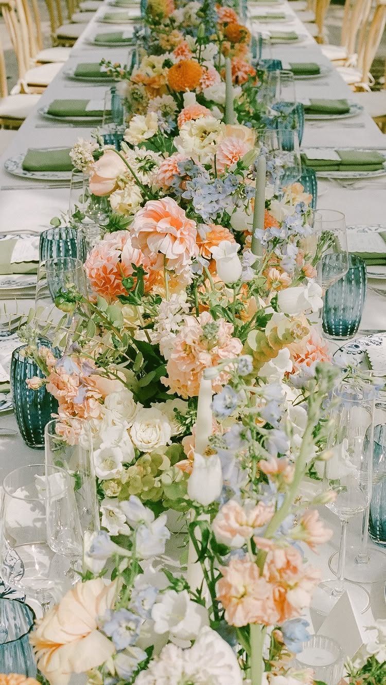
Coral, cream and soft blue carry the palette, and the look stays light enough to let the venue do most of the work. The runner pulls the color in without needing florals everywhere else.
I like this one for a waterfront reception where the backdrop is already part of the design. It gives you a theme without committing to heavy decor, and the glassware is easy to rent in most coastal markets.
2. Tropical Coastal Chic
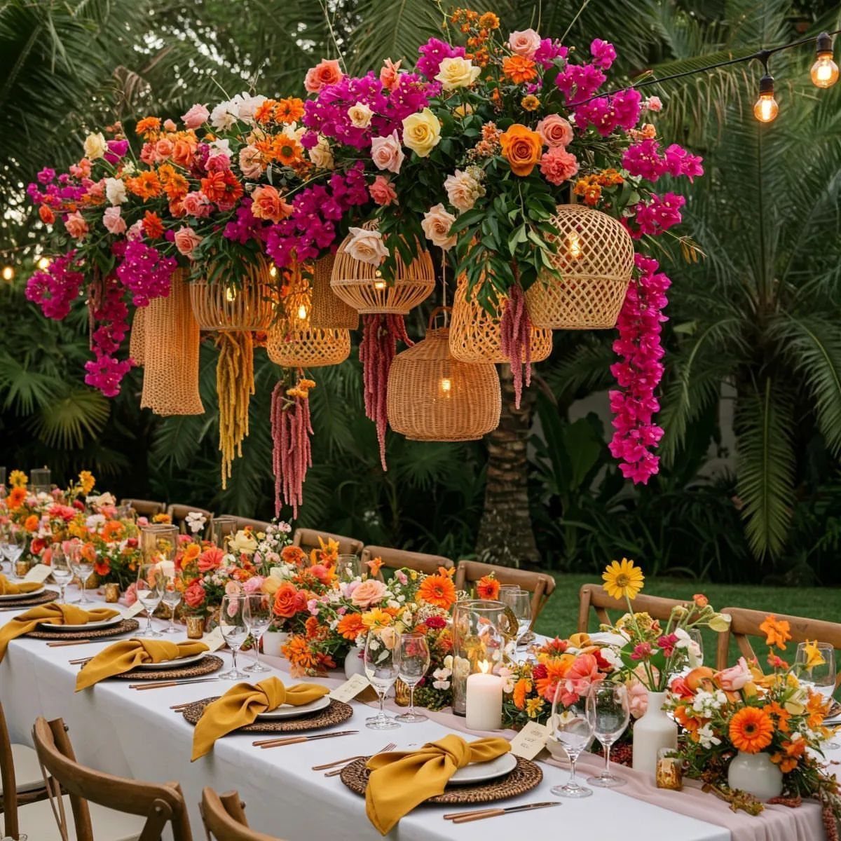
The same venue type, but the palette moves from pastels to saturated tropical color. Orange, fuchsia and yellow come in through the flowers and the linens, and the wicker lanterns keep the material palette grounded in natural texture.
The hanging installation is the statement piece here.
If you are working with a florist, this is where the budget goes. For a smaller version, concentrate the color on the table and skip the overhead arrangement.
3. New Rustic Neutrals
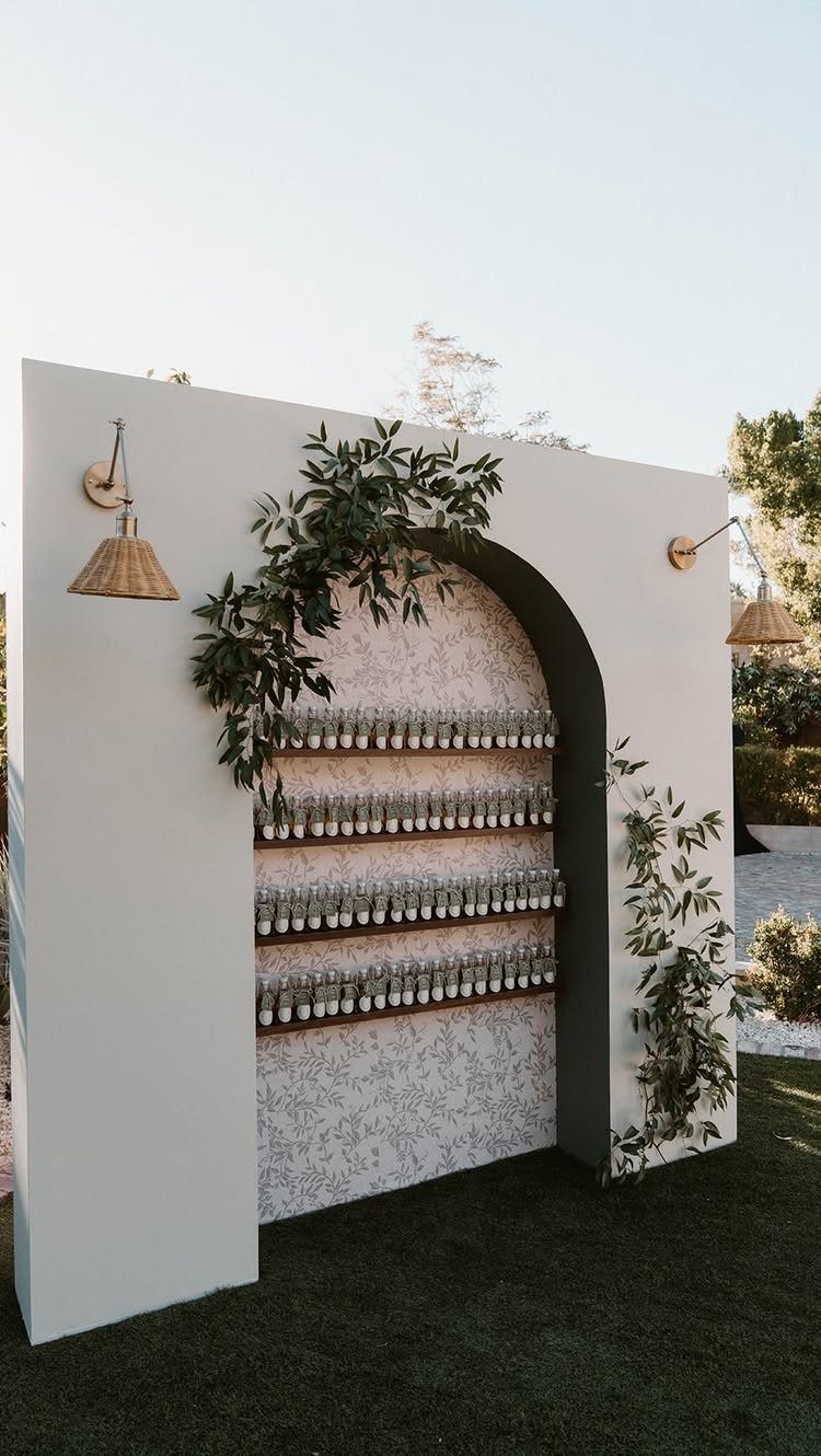
Cream, ivory and soft green stay neutral, but the pieces say handmade rather than formal. The bottle display and papered backdrop are both DIY jobs if you want to put the time in.
This setup makes sense for a backyard or garden wedding where you’re building the whole thing yourself. The look is intentionally homespun, so imperfections read as part of the style rather than mistakes.
4. Bold Blooms & Blossoms
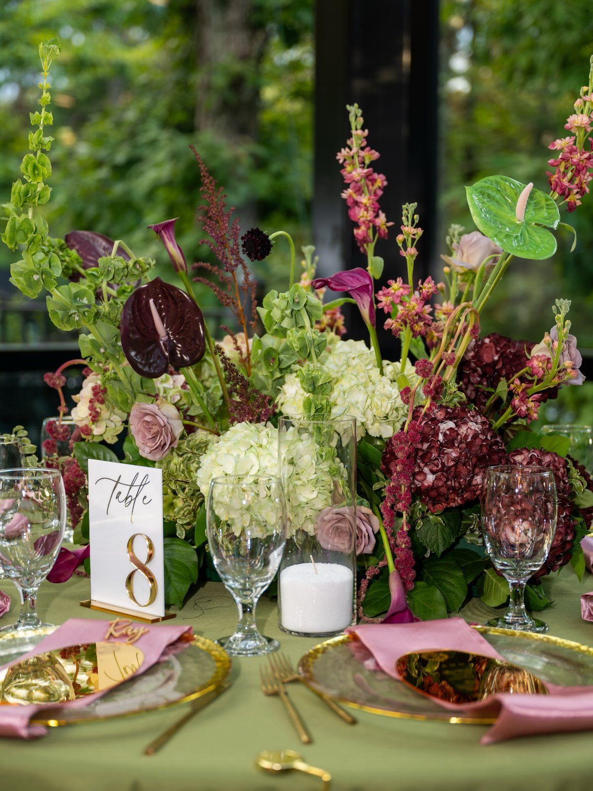
Deep red anchors the palette, with burgundy, plum and white in the flowers and gold accents in the place settings. The green cloth keeps the red from taking over.
The centerpieces are tall and full, which means they need enough room between tables for guests to move. I would use this for a formal evening reception where the florals are the main decor investment.
5. Art Nouveau Vintage Luxury
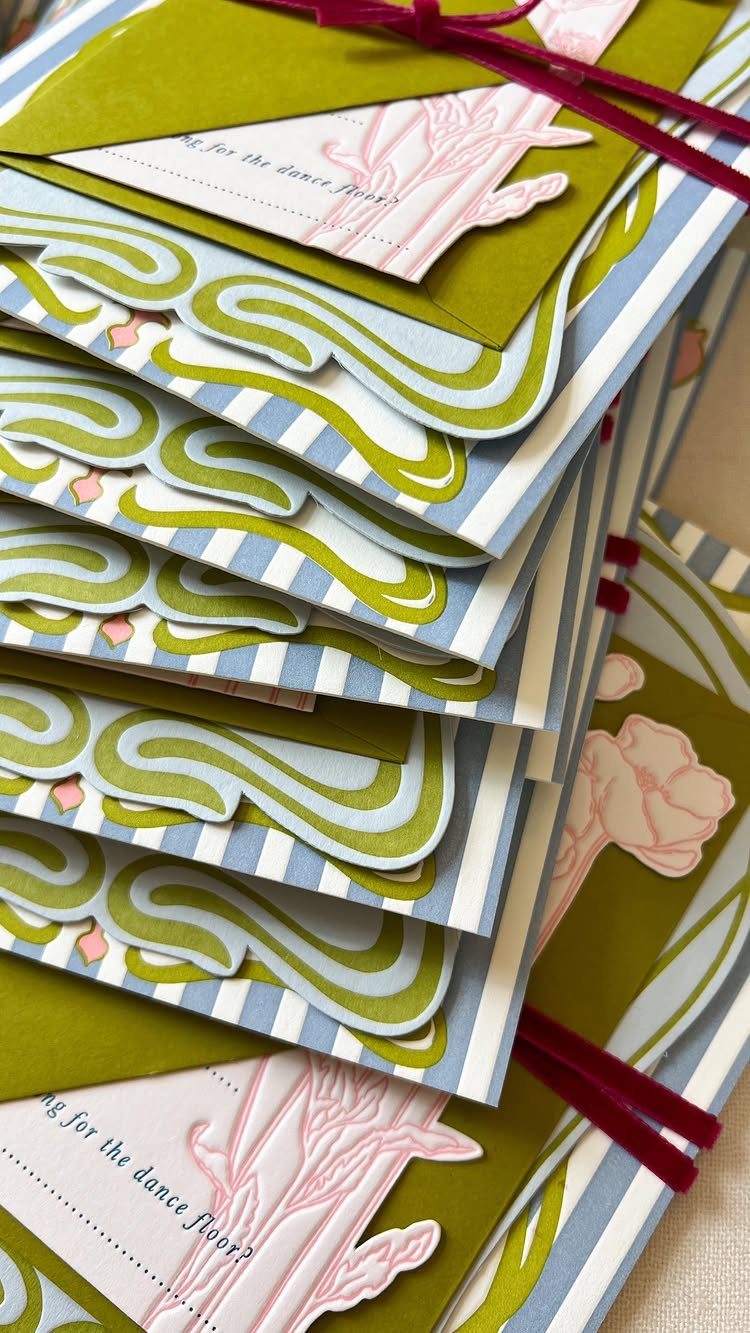
Olive green, dusty blue and muted pink run through the stationery, and the illustrated florals give it a turn-of-the-century feel. The color palette is subdued enough to read as vintage without looking faded.
If you are printing your own invitations, the Art Nouveau borders and swirls are available as free vector files.
The tricky part is matching the weight and texture of the paper stock, which matters more here than it does for brighter, modern designs.
6. Floral Classic Neutrals
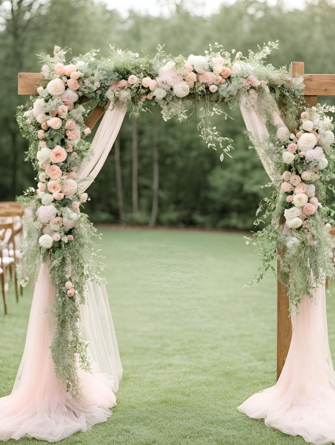
Blush, ivory and cream stay classic, and the tulle draping softens the structure of the wooden arch. The flowers are roses and greenery, which gives you the most flexibility with seasonal availability.
This is the safest choice if you are unsure about color.
The palette photographs well in any light, and the style fits both garden and indoor ceremonies. The arch rental is usually included with the florist’s package.
7. Warm Classic Neutral Palette
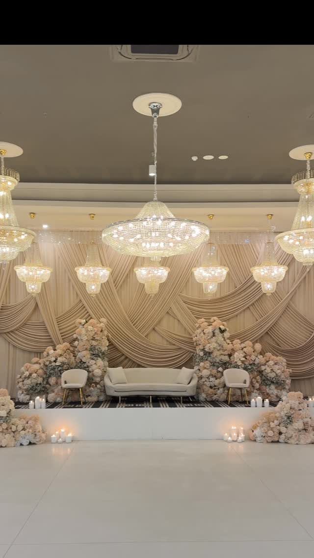
Beige, blush and ivory run through the draping and the florals, and the chandeliers add formality without breaking the warm palette. The white furniture anchors the setup.
This works for an indoor stage where formality matters but stark white feels too cold. The draped fabric hides wall texture or mismatched paint, and the chandelier rental usually includes installation if you book through the venue’s preferred vendor.
8. Woodland Storybook Romance Palette
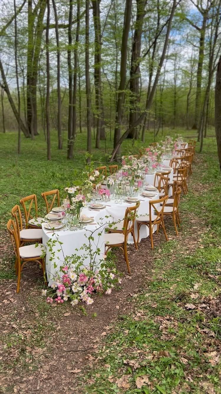
The wooden chairs keep the material palette natural.
If your ceremony or reception is already in a wooded clearing, the trees are the backdrop and you only need to dress the table.
9. Glamorous Emerald Wedding Palette
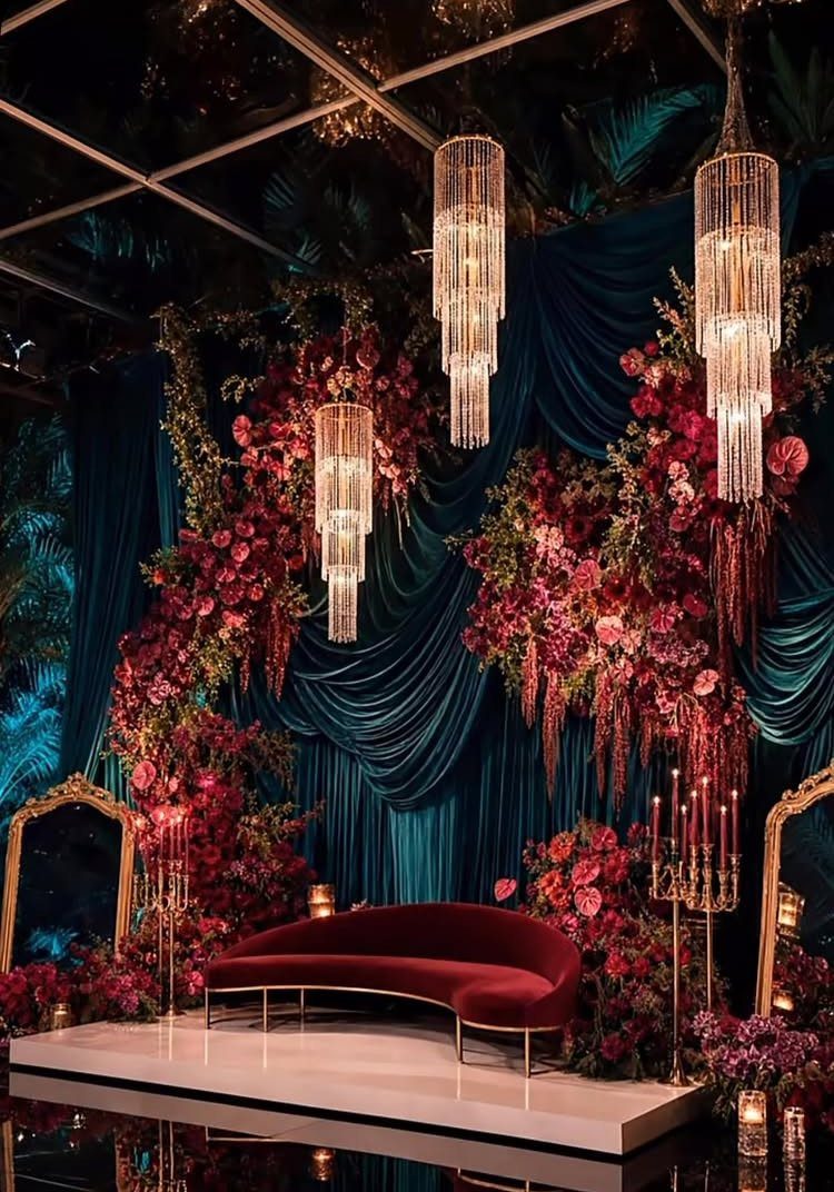
Emerald green fabric dominates, with deep red roses and gold mirrors pulling in the warmth.
The draped fabric is the most labor-intensive piece. If you are renting, ask whether installation is included; hanging that much yardage evenly takes rigging.
10. Glamorous Elegant Boho Wedding Palette
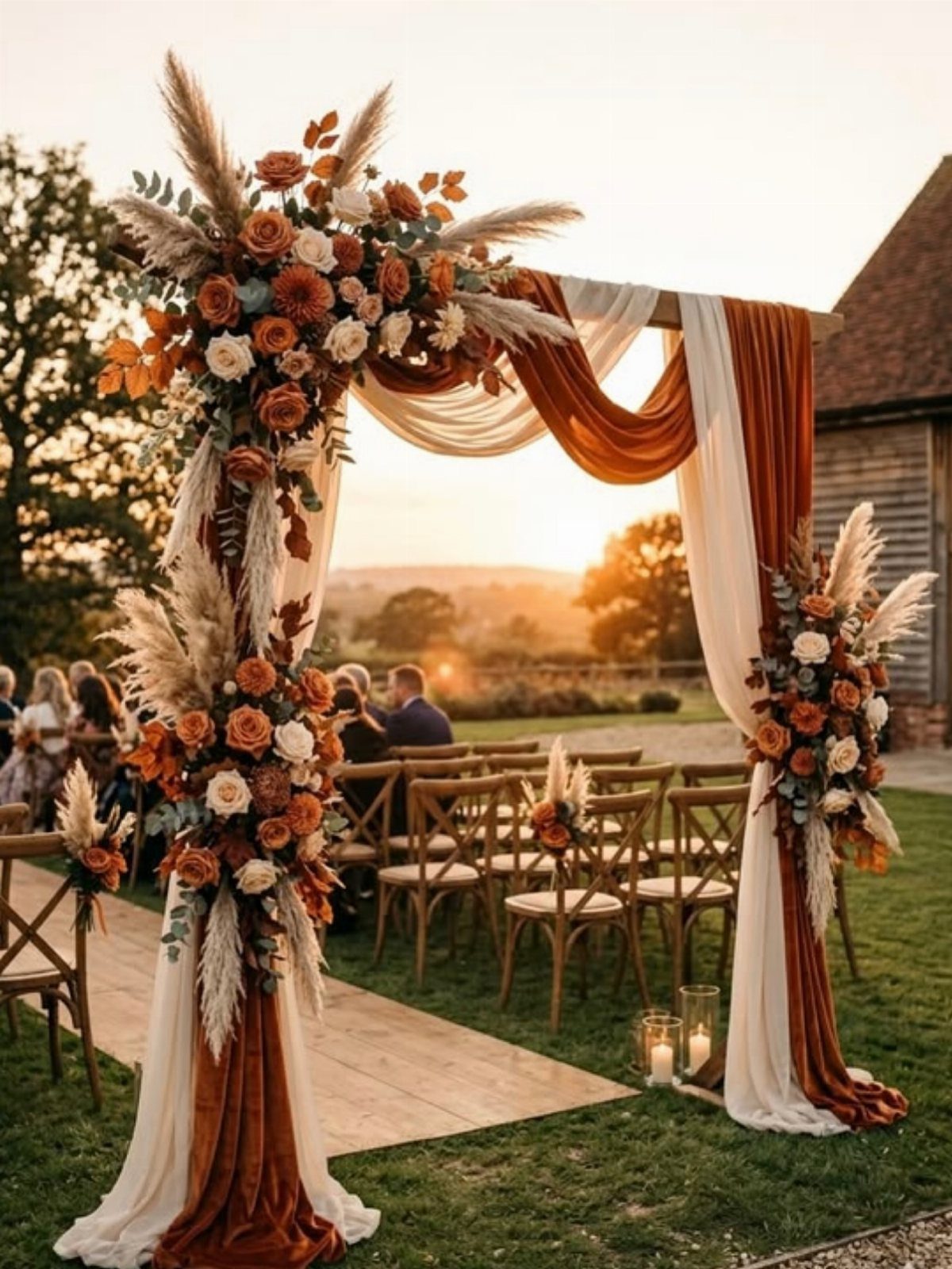
The orange roses add a punch of color where the light hits.
Pampas is cheaper than most florals and holds up well outdoors. The boho look comes from the mix of fabric and dried grass, so you can skip heavy arrangements on the sides and concentrate the budget on the arch itself.
11. Olive Green and Deep Red
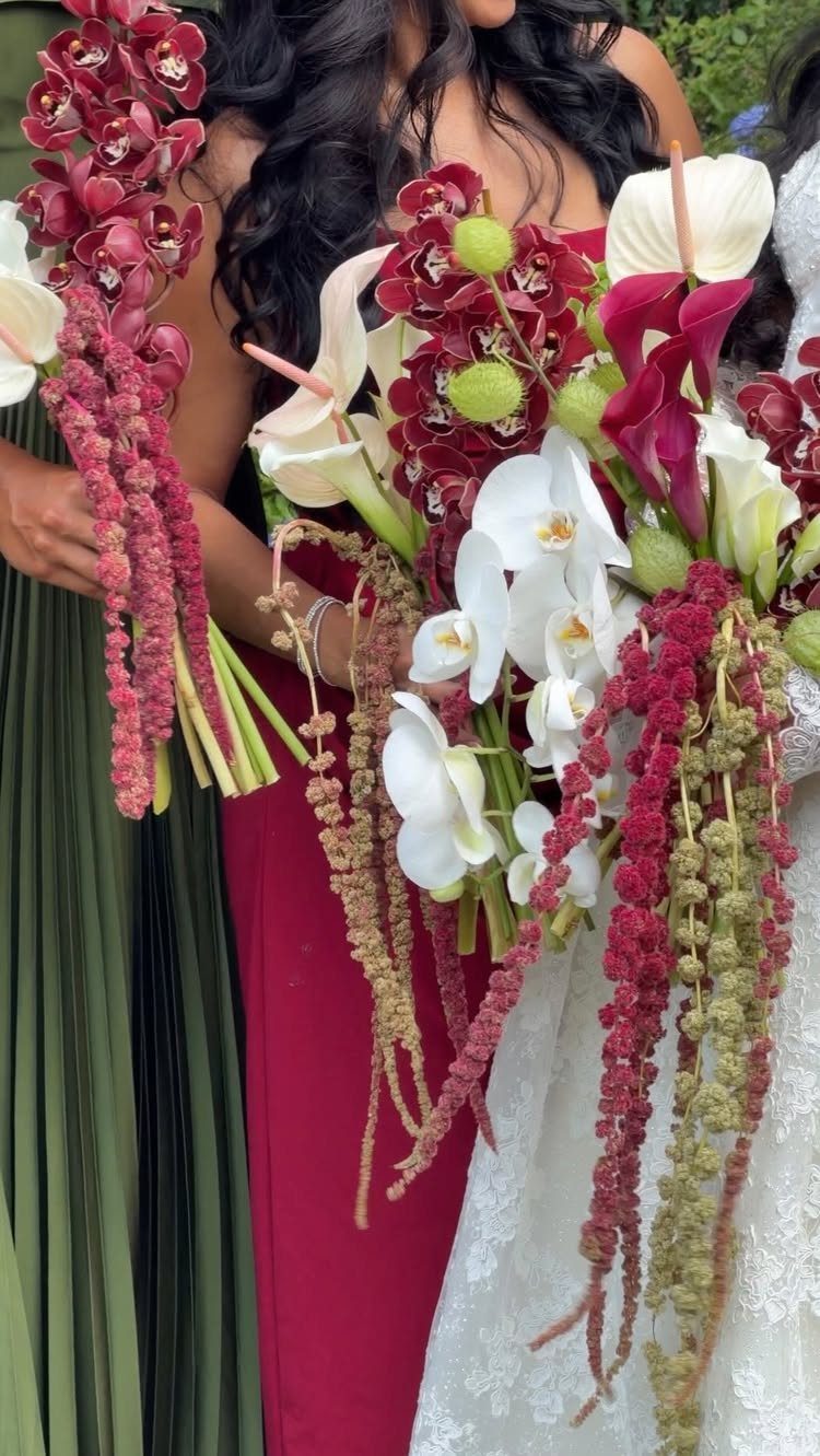
The dresses split the palette between olive green and deep red, and the bouquets mirror that division with red and white flowers. The bride stays in white, so the color sits entirely with the bridal party.
If you are asking bridesmaids to buy their own dresses, give them the exact shade name or a swatch. Olive green shifts between yellow and gray depending on the dye lot, and a mismatch shows up in every group photo.
12. Bright Tropical Colors
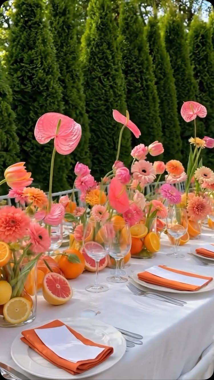
Orange and pink flowers mix with sliced citrus in the centerpieces, and the fruit adds dimension without needing extra floral stems. The white linens keep the table from feeling too busy.
The citrus holds up for about 3 hours before it starts to brown at the edges.
If your reception runs longer, add the fruit right before guests sit down. The anthuriums are widely available in tropical climates and cost less than imported blooms.
13. Vibrant Multicolor Florals
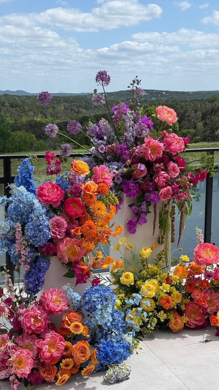
Pink, purple, orange, yellow and blue all sit together in the arrangements, and the pedestals keep them at eye level without needing a full arch structure. The cloudscape behind lets the color read even stronger.
This palette works when the flowers are the only decor element and the venue backdrop is plain enough to recede. The look needs full, dense arrangements to land; sparse stems in this many colors read as disorganized rather than intentional.
14. Colorful Disco Romance
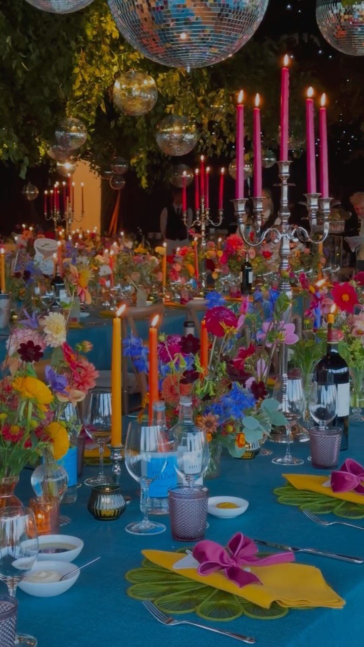
Bright blue cloth anchors the table, and yellow napkins, pink candles and saturated florals build on that base. The disco balls hang overhead and catch light without adding another color to manage.
The blue-and-yellow combination is high contrast, so the flowers need enough variety to bridge the two.
If you are renting linens, order swatches first; blue shifts between teal and cobalt depending on the dye lot, and the napkin color has to hold up against whichever one arrives.
15. Pastel Pink and Blue
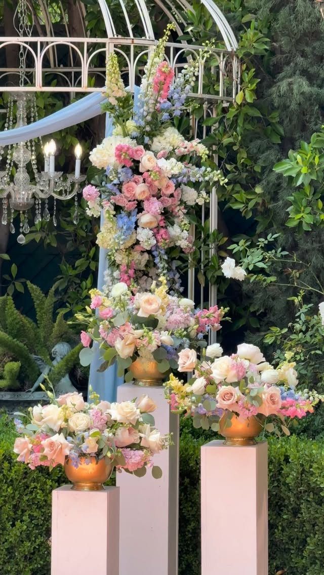
Pastel pink and blue flowers sit on pink pedestals, with cream blooms to soften the transition. The chandelier and soft blue fabric keep the formality level up without darkening the palette.
This setup suits a garden ceremony where the greenery is already in place and you only need to define the focal point.
The pedestals are easier to transport and set up than a full arch, and they work on uneven ground.
16. Pink and Burgundy Glamour
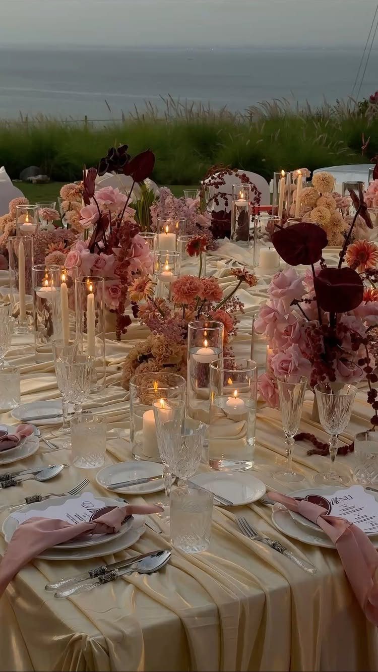
Champagne gold linens with pink and burgundy florals give you a warm palette that holds up in evening light.
The candles are the secondary decor layer here, and they matter; the glow fills in the gaps between arrangements without needing more flowers.
The gold cloth shows stains, so plan for a backup if the venue does not offer late-day linen swaps.
17. Blush Pink Reception
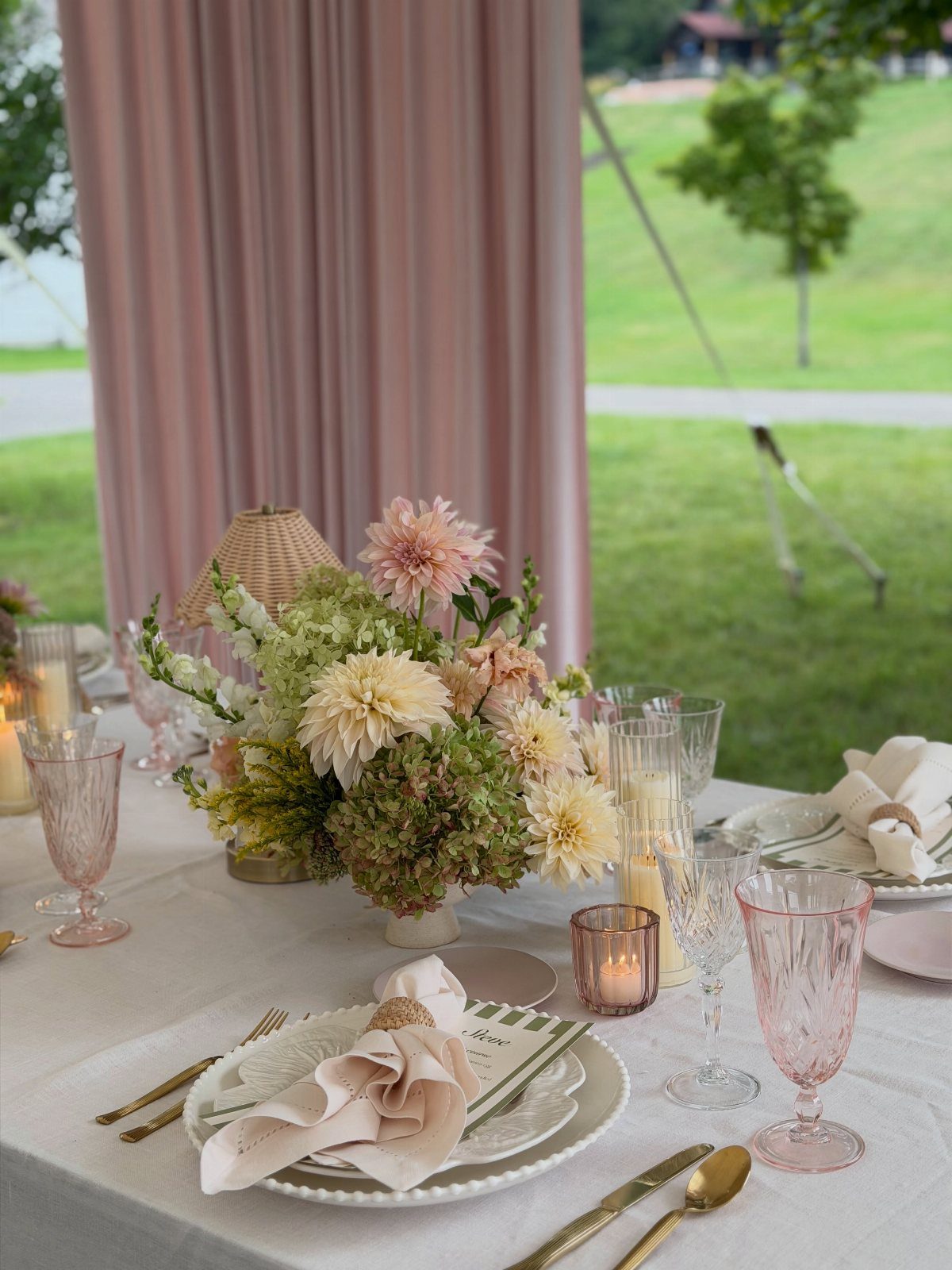
Pink glassware carries the color across the whole table, and the cream-and-pink florals keep the look soft rather than saturated. The pink backdrop extends the palette behind the seating area.
The glassware is the investment here.
Rental companies usually stock pink in limited quantities, so confirm availability early or plan to buy a full set. The backdrop fabric is easy to hang from a frame if the venue allows temporary rigging.
18. Autumn Red and Gold
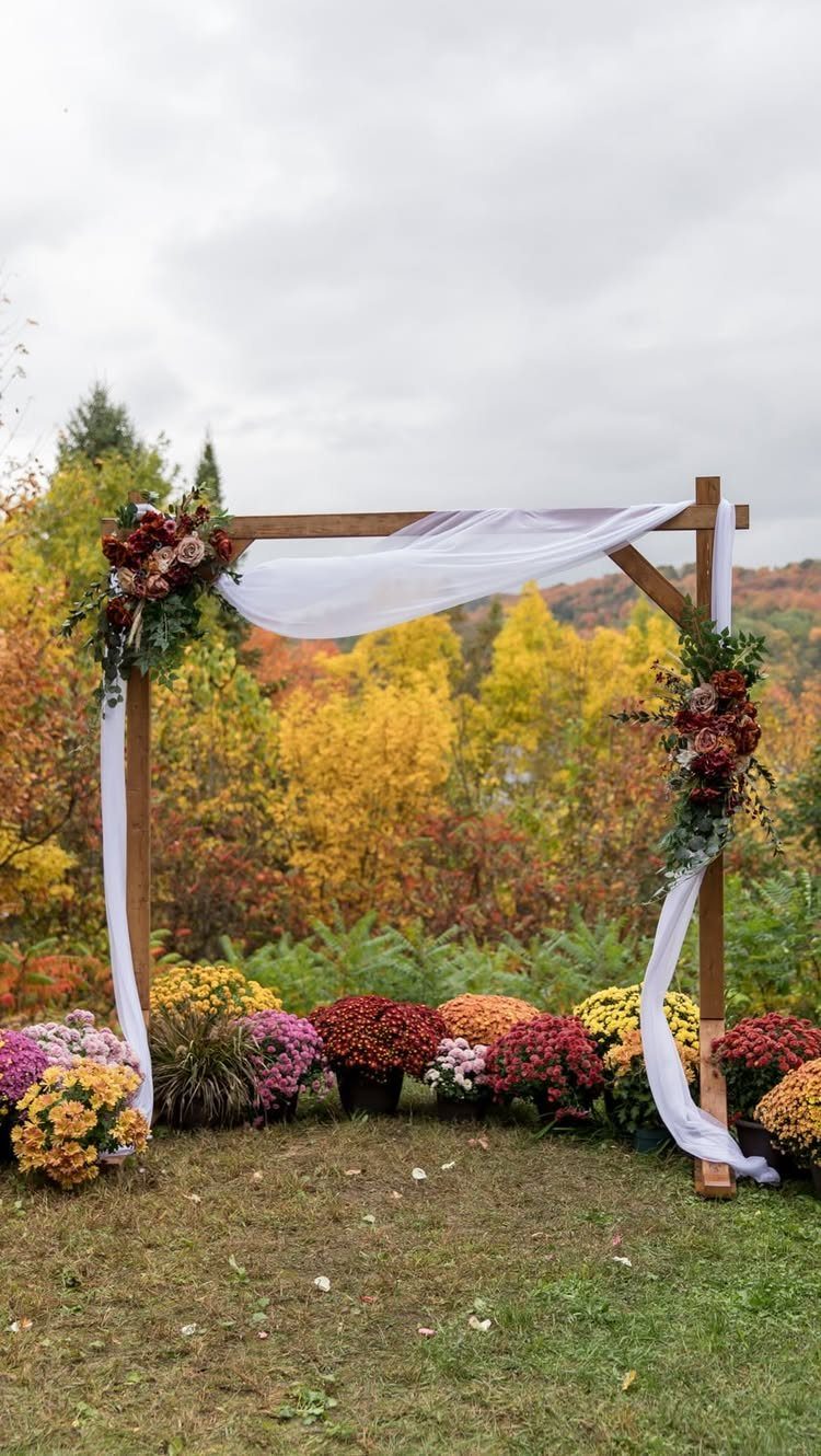
Red and burgundy flowers against a wooden arch let the autumn foliage do the color work.
This timing is narrow. Peak fall color timing varies by region, and you need to book the ceremony date before the leaves turn to know whether the backdrop will cooperate.
Past-peak foliage reduces the contrast, and the red flowers read more neutral against the faded leaves.
19. Orange and Pink Ceremony
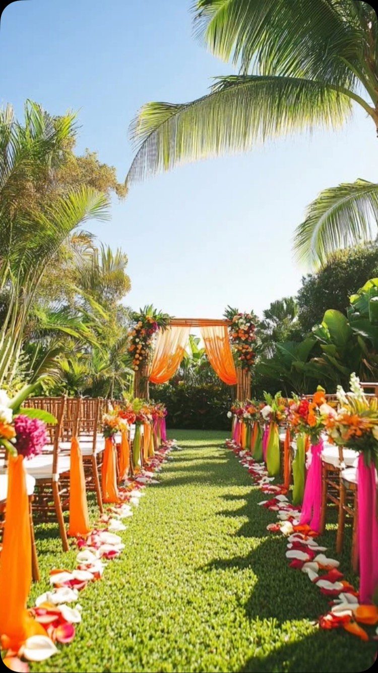
Orange fabric wraps the arch frame, and orange and pink ribbons tie onto the aisle chairs to pull the palette down the walkway. The flower petals mark the path without needing a full runner.
The fabric yardage is the main material cost, and the chair ties are a quick assembly job the morning of. The petals need to go down within an hour of the ceremony start; past that, wind scatters them.
20. Orange and Dried Foliage
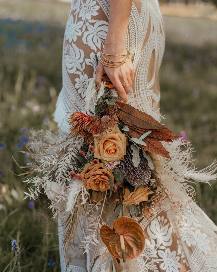
Orange roses anchor the bouquet, and dried grasses and brown leaves fill out the shape without adding more fresh stems. The palette stays warm and the dried material holds up longer than most florals in direct sun.
If you are assembling your own bouquet, the dried foliage costs less per stem than greenery and weighs almost nothing. Dried grasses shed slightly when handled, so wrap the stems tightly and keep a lint roller nearby for the dress.
21. Burgundy and Blue Florals
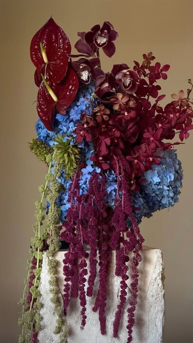
Burgundy anthuriums and deep red amaranthus sit against blue hydrangeas, and the green foliage bridges the two without diluting either color. The contrast is high, so this arrangement needs a plain backdrop to read clearly.
Blue hydrangeas hold their color for about 4 hours out of water, which matters if you are moving arrangements from ceremony to reception.
Anthuriums last longer and tolerate heat better, so if the event is outdoors in warm weather, weight the arrangement toward the burgundy blooms.
22. Champagne and Cocoa Neutrals
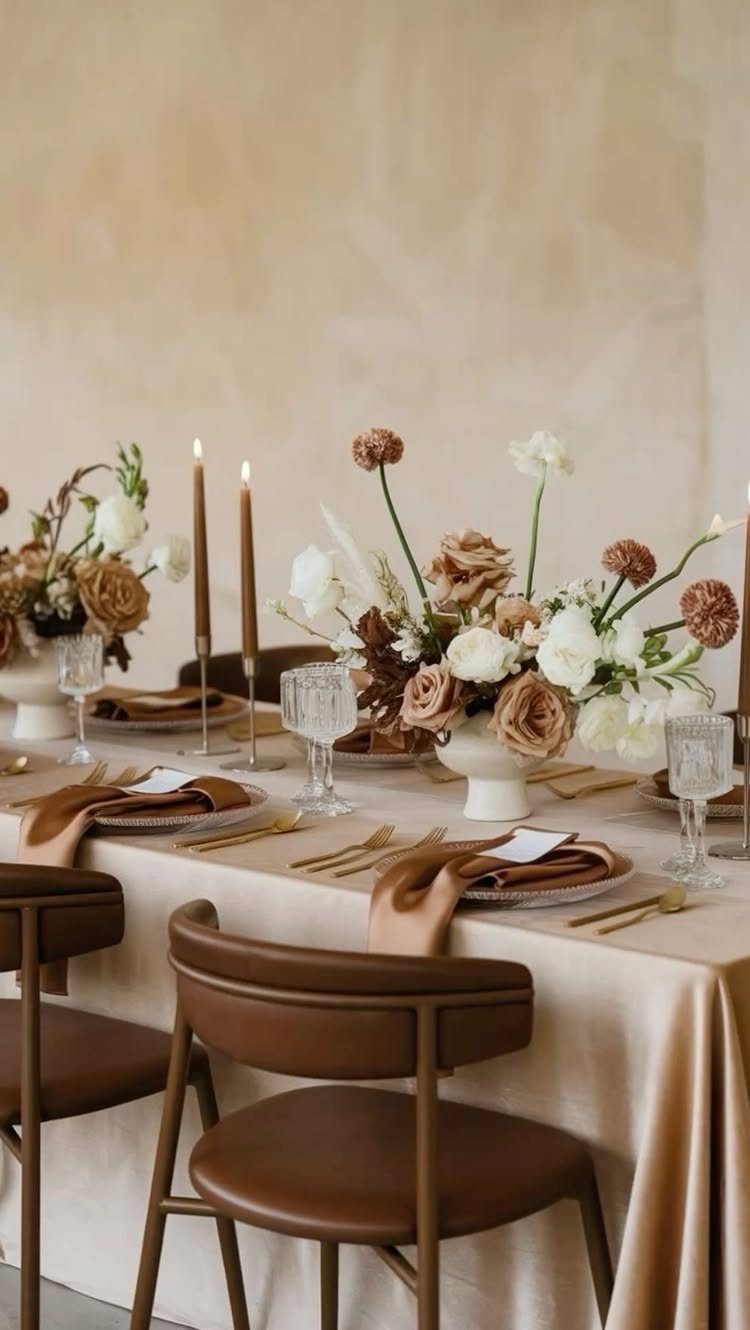
Beige linens and brown chairs set the base palette, and cocoa candles repeat the brown without needing dyed fabric. The florals stay in the same range, with cream and tan blooms that do not compete for attention.
This palette suits a daytime reception where you want warmth but formal white feels too stark. The brown chairs are harder to rent than standard neutrals, so confirm availability early or plan to cover ivory chairs with brown sashes.
Venue, Season, and Wedding Mood
The venue color and architecture matter before you pick anything else.
If the walls are brick or the space opens onto a lake, that backdrop is already setting a tone, and your palette either works with it or fights it all day.
Season affects what reads as intentional. Burgundy and rust look grounded in October; the same colors in June need a reason or they feel out of step.
Mood follows from saturation and contrast.
Deep purple and emerald read as formal and luxe. Blush and cream stay light.
Bright coral and fuchsia push the energy up. Navy or charcoal adds drama, especially under evening light.
If you are working with a space that has strong existing color, test your palette on-site rather than only in photos. What looks balanced on a white wall can feel off once the venue’s own tones enter the frame.
Choosing and Using a Palette
Pick colors you like rather than what’s trending for the year you’re getting married. Blush, champagne, sage, warm neutrals, burgundy and berry tones were all popular for 2027 weddings, but popularity does not mean they belong in yours.
A focused palette makes the rest of the decisions easier. Use 3 to 5 colors and let them guide the bridesmaid dresses, flowers, linens, invitations and decor.
I structure most palettes with a dominant color, two or three supporting tones, one neutral, and a single accent that stands out in the small touches.
Spring and summer lean toward pastels and brights; fall and winter suit deeper tones and jewel shades. The season gives you a default palette if you are starting from scratch.
Monochromatic weddings are the perfect choice for those who love a favorite color so much they want to use it exclusively for their big day. Monochromatic layering is a key 2026 trend, combining multiple shades and textures within one color family for depth and sophistication.
Check Color in Real Materials
Order physical samples before you commit.
A HEX code gives vendors a starting point, but final choices happen when you put the actual fabric, paper and flowers side by side.
A swatch of the linen next to the invitation stock shows you whether the colors actually work together, and it catches mismatches before anything is printed or rented.
Lighting changes how color reads.
A blush that looks soft in daylight can wash out under tungsten, and a burgundy that feels rich indoors can look muddy in full sun. Test samples in the same light conditions as your ceremony and reception.
One rule for balance is 60-30-10: a dominant color, a secondary, and an accent.
Frequently Asked Questions
What is the best color theme for a wedding?
The best palette is one you like and that works with your venue’s existing tones. Test samples on-site because colors shift under different lighting and against the venue’s walls or backdrop.
What are the trendy colors for weddings in 2026?
Soft pink, taupe, sage and wine showed up across 2027 weddings, but a crowded choice is not automatically the right one. A palette you chose deliberately will feel more yours than one you borrowed from a trend report.
How many colors should a wedding color palette have?
Use 3 to 5 colors.
I structure most palettes with a dominant color, two or three supporting tones, one neutral, and a single accent that stands out in the small touches. A working proportion splits the palette 60-30-10 across main, secondary and accent.
How do I choose wedding colors that work with my venue?
The venue color and architecture matter before you pick anything else.
Stone walls or an open view already set the mood, and your choices either support that or argue with it. Bring swatches to the space instead of relying on screen colors, because the room’s own tones change what works.
Can I share HEX codes with my wedding vendors?
A HEX code helps vendors match digitally, but the real check is seeing the fabric, card stock and flower next to each other.
Request samples before you order because laying the napkin against the invitation shows whether they actually belong together, and it stops a mismatch before it gets printed or shipped.