
Sage green and brown is a wedding palette built from natural materials: moss, weathered wood, unglazed clay.
It works across nearly any venue and every season, but the shade you choose within each color decides whether the result feels right for your date.
Powder blue carries the "something blue" tradition through the bridesmaid lineup; brown leather and sage ties distribute the palette through the groomsmen without custom pieces.
1. Start With Sage and Brown as the Base
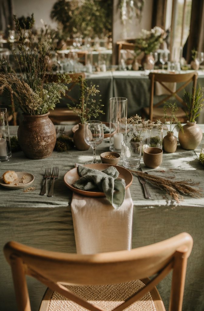
Sage green and brown anchor the palette because they mirror natural materials — moss, lichen, weathered wood, unglazed clay — and read as grounded rather than fussy.
Sage green brings the softness of summer foliage without the intensity of emerald or forest. Earth brown adds depth and a subtle vintage warmth that keeps the whole scheme from feeling too ethereal or washed out.
The combination works for weddings because it suits nearly any venue, from a backyard ceremony to a rented hall, and it holds up across seasons without looking like it belongs to just one.
Beige and white act as breathing room. They soften the edge where sage meets brown and let textures — linen, dried grass, raw wood — take focus.
Layering in other greens gives variety without breaking the palette. The base stays sage and brown, and everything else adjusts around it.
2. Add an Accent Color for Contrast
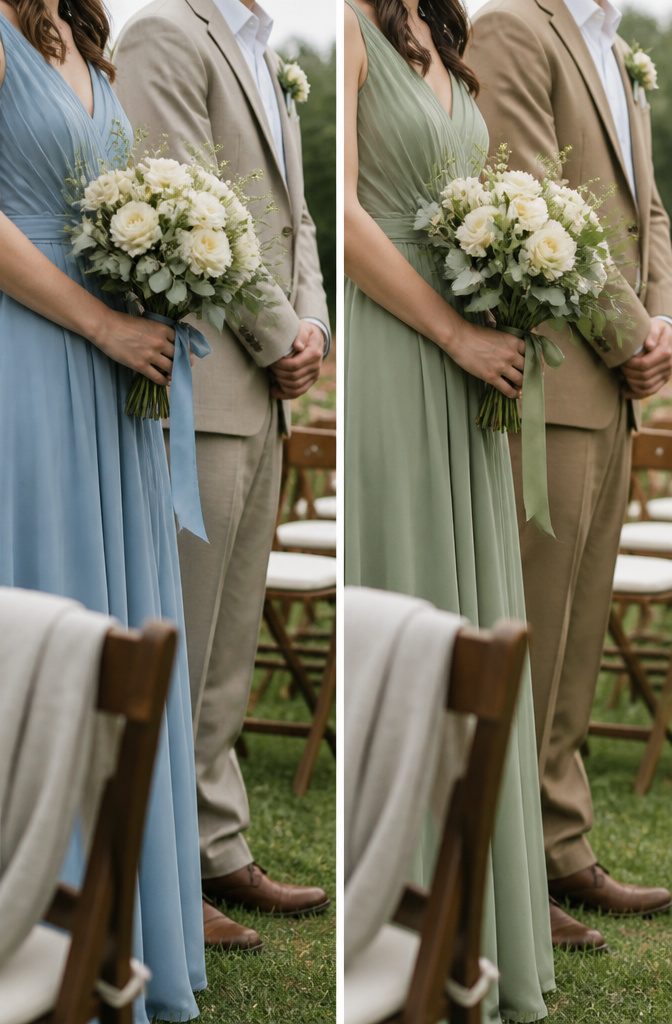
Sage and brown work beautifully together, but the palette can feel flat without something lighter to break it up. Powder blue brings contrast and serves as "something blue", a traditional wedding symbol for love and fidelity.
Robin’s-egg blue works the same way, just slightly brighter. Dusty pink and dusty blue both add softness without competing with the earthy base colors.
The accent matters because it gives the eye somewhere to land. Without it, arrangements and table settings tend to read as one continuous tone, especially in photos.
A bridesmaid in powder blue or dusty pink stands out against sage in a way that looks intentional rather than washed out. The same goes for ribbon on bouquets or the lining of a ceremony program.
Keep the accent color in small doses. It should show up in florals, bridesmaid dresses, napkins, or signage, but not dominate the palette the way sage and brown do.
3. Carry the Palette Through the Bridal Party
The bridal party keeps the palette cohesive without requiring everyone to wear the same shade.
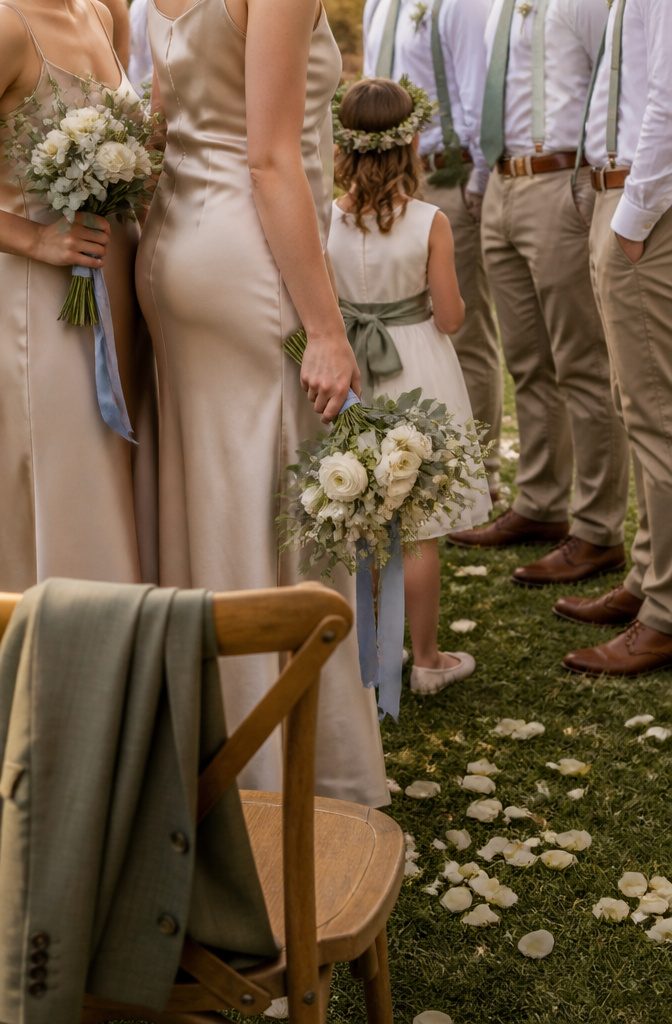
I’d put bridesmaids in non-train satin dresses in light beige, which grounds the earthy side of the palette and sits between the sage and brown without competing with either.
The silhouette stays relaxed and airy rather than structured, so the color does the work. Powder blue ribbons tied to their bouquets carry the "something blue" tradition through the lineup and give a soft contrast against the beige fabric.
Groomsmen pick up sage and brown through accessories rather than suiting. Sage green ties or pocket squares distribute the green across the party, and brown leather belts or shoes anchor the earthy tone without requiring custom rental pieces.
A flower girl dress gains a sage green sash, which repeats the color at child scale and ties her visually to the rest of the group.
The palette moves through the wedding party in small, deliberate doses rather than dressing everyone head to toe in theme colors, so the effect reads coordinated instead of costumed.
4. Build Arrangements Around Greenery and Texture
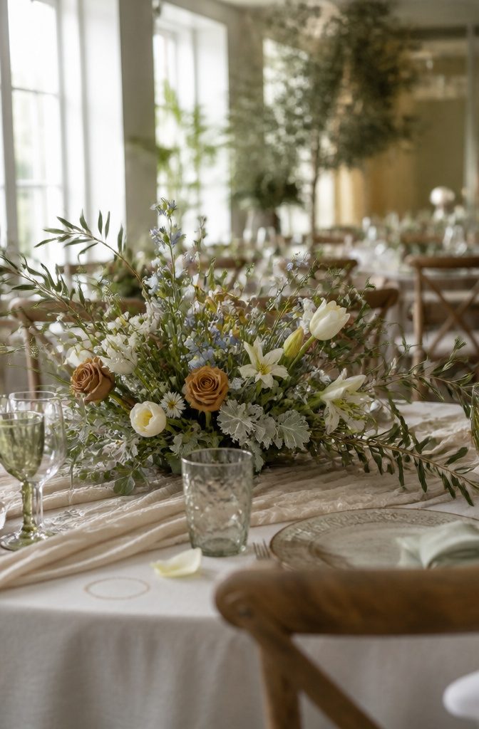
Greenery decides the shape of the arrangement before the blooms do.
Eucalyptus and olive branches give you outward-reaching stems that break the silhouette open rather than holding everything in a tight globe. Dusty miller adds soft, silver texture at the base and keeps the palette from leaning too warm.
Roses and tulips anchor the color, both matte enough to read as garden-grown rather than glossy florist stock. Lilies bring clean, architectural lines where you need height or a deliberate angle.
Small daisies drop in countryside texture without much bulk, and powder-blue wildflowers offer contrast in small doses tucked between the greenery. I keep them sparse so the brown and beige base stays visible.
Varied flower heights and movement matter more than symmetry here. The arrangement should feel like it grew outward, not like it was trimmed into place.
5. Create a Garden-Like Ceremony Backdrop
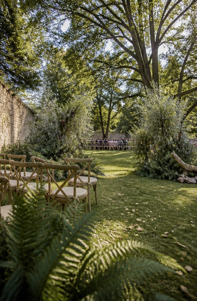
A greenery-led installation works better than a traditional arch when sage green and brown are your base.
Aim for a backdrop that feels grown rather than built, so start with grounded clusters at the base and let upright greenery carry the eye upward.
Think seeded eucalyptus, olive branches, and ferns layered in uneven heights, anchored with brown stems or driftwood rather than symmetrical metal frames.
The summer setting does most of the work. I like this approach because it keeps the couple inside a lush, verdant frame that feels private and immersive, and the material cost stays lower than a full floral arch.
Skip anything too rigid or evenly spaced. Let the greenery look like it grew there, not like you assembled it.
6. Style Reception Tables and Stations
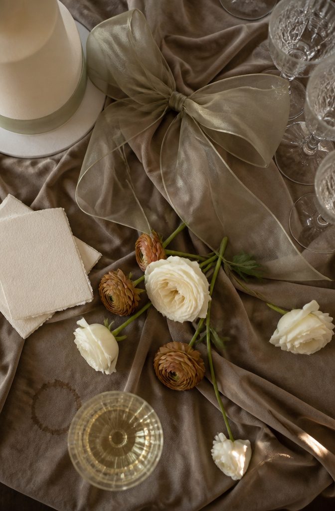
Reception tables carry the palette through the details someone touches: linen in sage or a soft oatmeal brown, menu cards on textured paper, and favors wrapped in matching ribbon.
The champagne station is where the palette lifts into something more sculptural. I anchor it with a monumental organza bow, the kind with enough body to hold its shape and enough transparency to catch the light.
The bow sits above a floor-pooling linen cloth that drapes in long, soft folds beneath the tower.
That fabric pairing does two things at once: the organza brings structure, the linen brings weight, and together they read as vintage couture rather than off-the-shelf decor.
Scattered blooms in cream and earth-brown tones finish the station without crowding it.
I use garden roses or loose ranunculus rather than tight arrangements, and I let a few stems lie flat on the cloth instead of standing them all upright.
The cake table follows the same logic: sage ribbon around the base tier, brown sugar blooms if the baker can pull them, and a cloth that pools rather than skims.
Stationery stays neutral, cream or kraft paper with brown ink, so the color lives in what you can hold and what drapes rather than what you read.
7. Adapt the Palette to Your Season
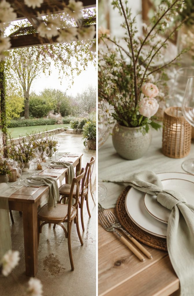
The sage green and brown wedding palette shifts with the season, and a few small adjustments keep it feeling current rather than fixed.
In spring, I lean toward lighter, more golden versions of both colors: pale celery sage with tan or camel brown, plus cream or blush as a third neutral.
The result reads soft and garden-like without losing structure. Summer can take the palette brighter, with true midtone sage and warmer amber browns that hold up in strong light.
Fall is where the combination feels most natural, so the standard midtone sage and cocoa brown need almost no adjustment. For winter weddings, I pull the sage toward gray-green or eucalyptus and pair it with deeper espresso or charcoal brown.
The muted, cooler tones suit low light and feel elegant rather than spring-forward. The palette stays recognizable across all four seasons, but the specific shades you choose will decide whether it feels appropriate or slightly off for the date.
8. Add Vintage Texture With Fabric Details
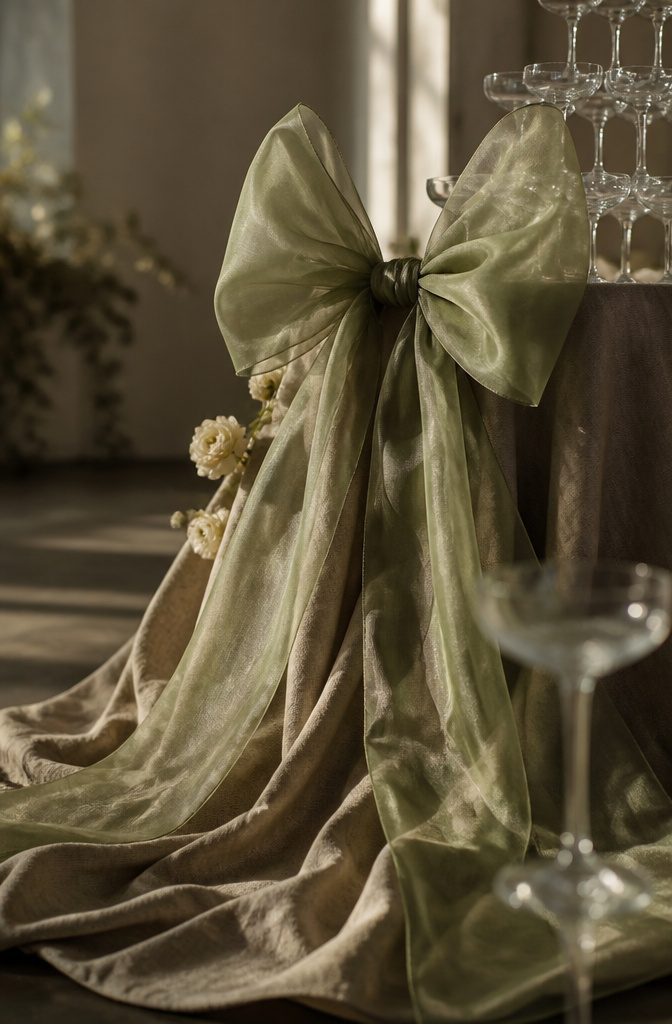
Organza and linen create a focal point that feels formal without tipping into stiff.
The organza holds its shape — a large bow stays crisp and dimensional — while linen drapes and pools at floor level, so the two fabrics answer each other rather than competing.
The semi-translucent organza catches light differently than the matte linen does, and that contrast reads as textural depth even from across a room.
I like this approach for a champagne tower or dessert station, where the fabric installation becomes the backdrop.
The scale matters: a small bow disappears, but an oversized one anchors the whole setup. The linen pooling beneath softens the base and keeps the look grounded in something organic rather than purely sculptural.
Colors That Pair Well With Sage
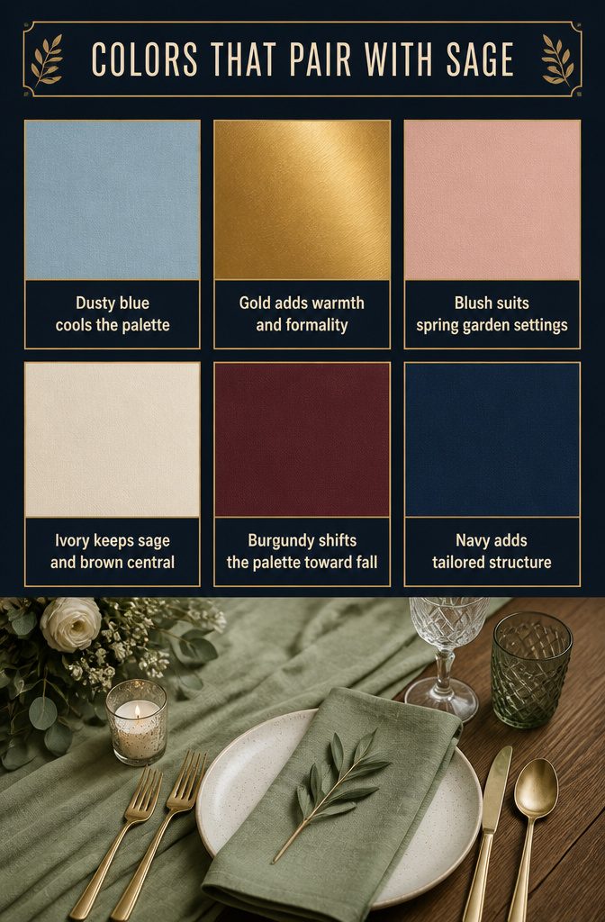
Sage opens up a lot of pairing options, and what you add shifts the whole mood of the palette. Here’s what works:
- Dusty blue or light blue cools the palette down and leans romantic. The muted tones stay soft next to sage without fighting for attention.
- Gold warms it up and adds formality. It reads as elegant without tipping into traditional ballroom territory.
- Blush pink or mauve softens the earthy base and works well for spring or garden settings. The contrast stays gentle.
- Ivory, cream or white keeps the palette neutral and lets sage and brown do the work. This is the safest route if you want flexibility across the day.
- Burgundy or wine deepens the palette and pulls it toward fall. The richness makes sage feel less pastel.
- Navy grounds the palette and gives it structure. It works especially well if you’re aiming for a more tailored or nautical look.
How to Coordinate Family and Guest Outfits
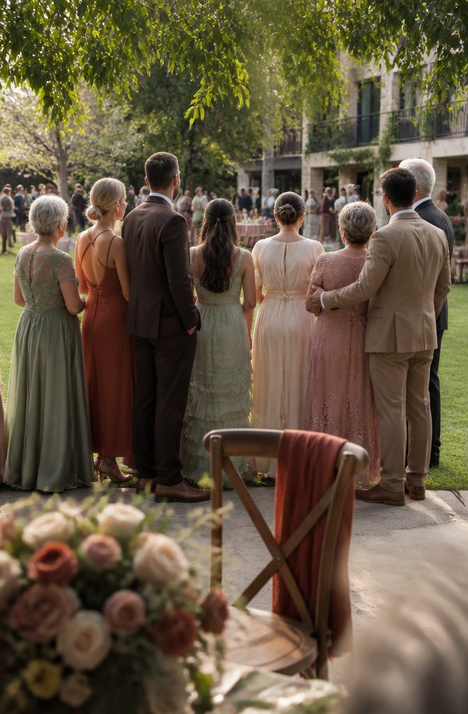
I assign the palette across the wedding party and immediate families first, then let everyone else choose from what’s already visible.
That makes about thirty people total in my case — the couple, the wedding party, parents, grandparents and siblings — and keeping them coordinated matters more than matching every guest who shows up.
I narrowed the full palette down to six colors that photograph well together: sage green, chocolate brown, cream, dusty rose, terracotta and soft gold.
Each person picks one or two from that list, and the mix balances itself as long as no single color dominates more than a third of the group.
Mothers and grandmothers leaned toward dusty rose and cream dresses, groomsmen wore chocolate or tan suits, and the bridesmaids split between sage and terracotta.
I pulled most of the examples from Old Navy, Target, Kohl’s, Maurices, Men’s Wearhouse, JCPenney and Macy’s because those stores stock enough formal options in these tones that families can shop without special orders.
For guests, I listed the six colors on the wedding website under attire and left it at that. Most people default to neutrals anyway, and anyone who wants to coordinate has the palette in front of them.
Frequently Asked Questions
Do sage green and brown look good together for a wedding?
Yes, sage green and brown pair well together because they mirror natural materials like moss, weathered wood, and unglazed clay, so the combination reads as grounded rather than overdone.
Sage brings softness without the intensity of darker greens, and brown adds depth and vintage warmth that keeps the palette from feeling washed out. The 2 colors suit nearly any venue and hold up across all 4 seasons.
What colors go with sage green and brown for a wedding?
Powder blue, dusty pink, cream, ivory, gold, burgundy, and navy all work alongside sage green and brown. Powder blue doubles as the traditional "something blue" and gives the eye a point of contrast in photos.
Gold adds formality, burgundy deepens the palette for fall, and ivory or cream keeps everything flexible if you want a softer, neutral-leaning look.
What color complements sage green the most?
Dusty blue or light blue tends to complement sage most cleanly because the muted, cool tones sit beside it without competing.
Gold is the strongest option if you want warmth and a more formal feel. Blush or mauve works well for spring and garden settings, where a gentle contrast reads better than a sharp one.