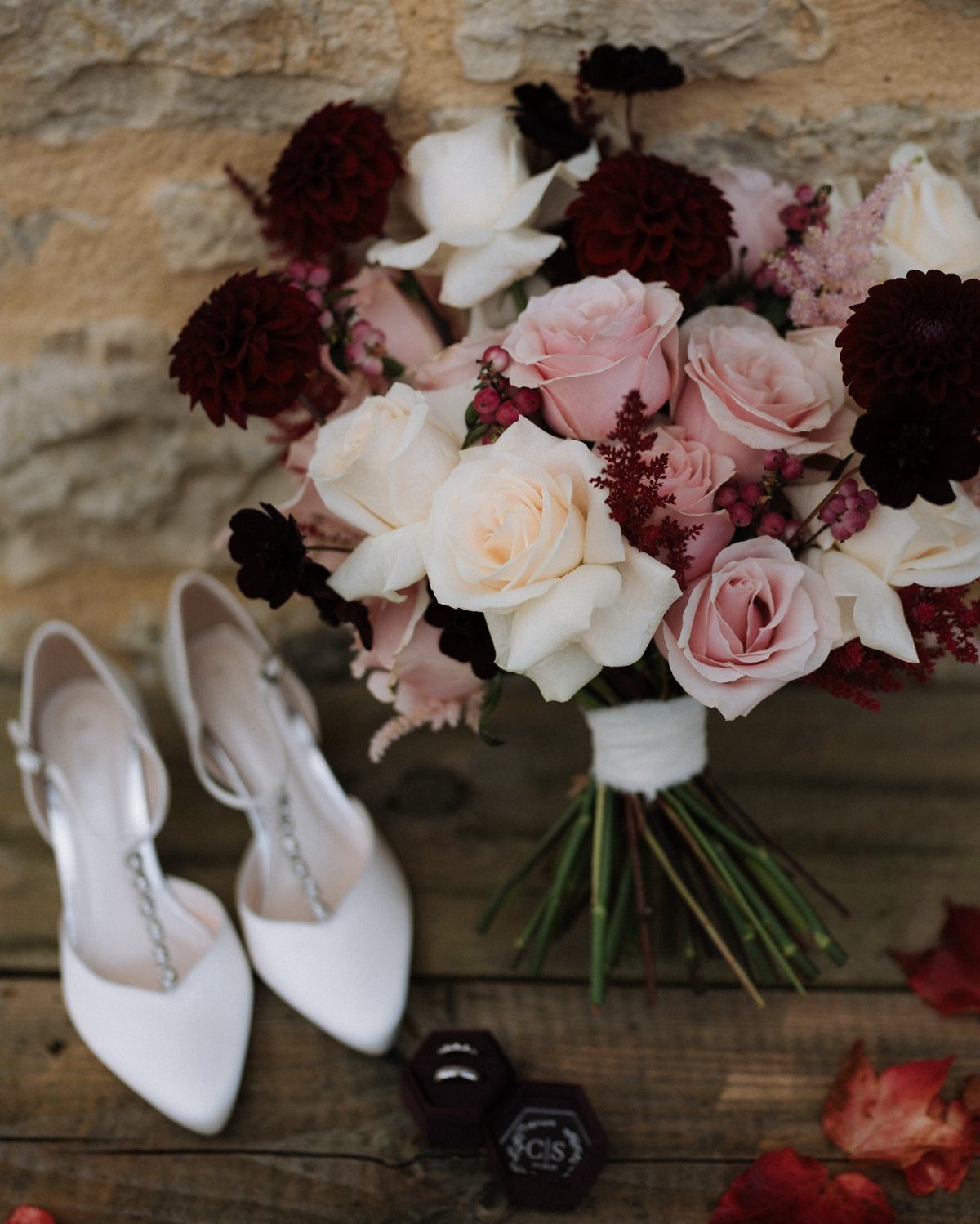
October wedding colors range from soft blush and burgundy to saturated jewel tone mixes with emerald, purple, teal and fuchsia.
The palette you pick depends on whether you want the season to show up clearly in the decor or stay as a backdrop: burnt orange and sunflowers make October unmistakable, while dusky pink and pale green nod to fall without matching the foliage.
1. Blush and Burgundy Wedding Flowers
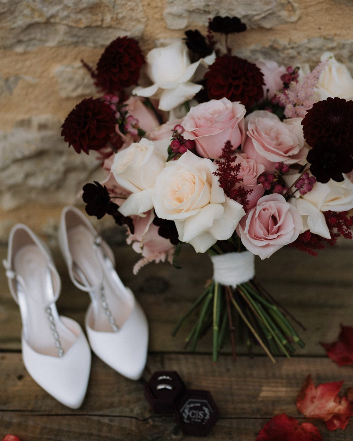
Blush and burgundy is one of the softest ways to bring in burgundy without it taking over the whole palette. The blush acts as a neutral that lets the burgundy feel rich rather than heavy.
Roses and dahlias work well here because both bloom in October and come in the exact shades you need. Blush roses stay soft even when they open fully, and burgundy dahlias hold their color through the whole day.
If you want more contrast, add white or cream flowers between the two. If you want it softer, lean toward more blush with burgundy as the accent.
May through September may be peak wedding season, but October is actually the most popular month to get married.
2. Burgundy and White
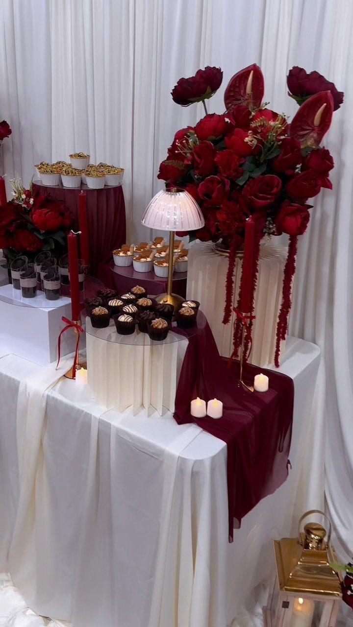
Burgundy and white gives you a cleaner, more formal look than burgundy and blush. The white keeps the burgundy from feeling too warm, and the contrast reads as intentional rather than romantic.
This palette works on a dessert table because white linens and plates let the burgundy flowers and fabrics stand out without competing.
Red roses in white vases keep the focus on the flowers, and chocolate or red velvet desserts pick up the burgundy without adding another color.
If you want the palette to feel less stark, bring in greenery or use ivory instead of pure white.
3. Burnt Orange
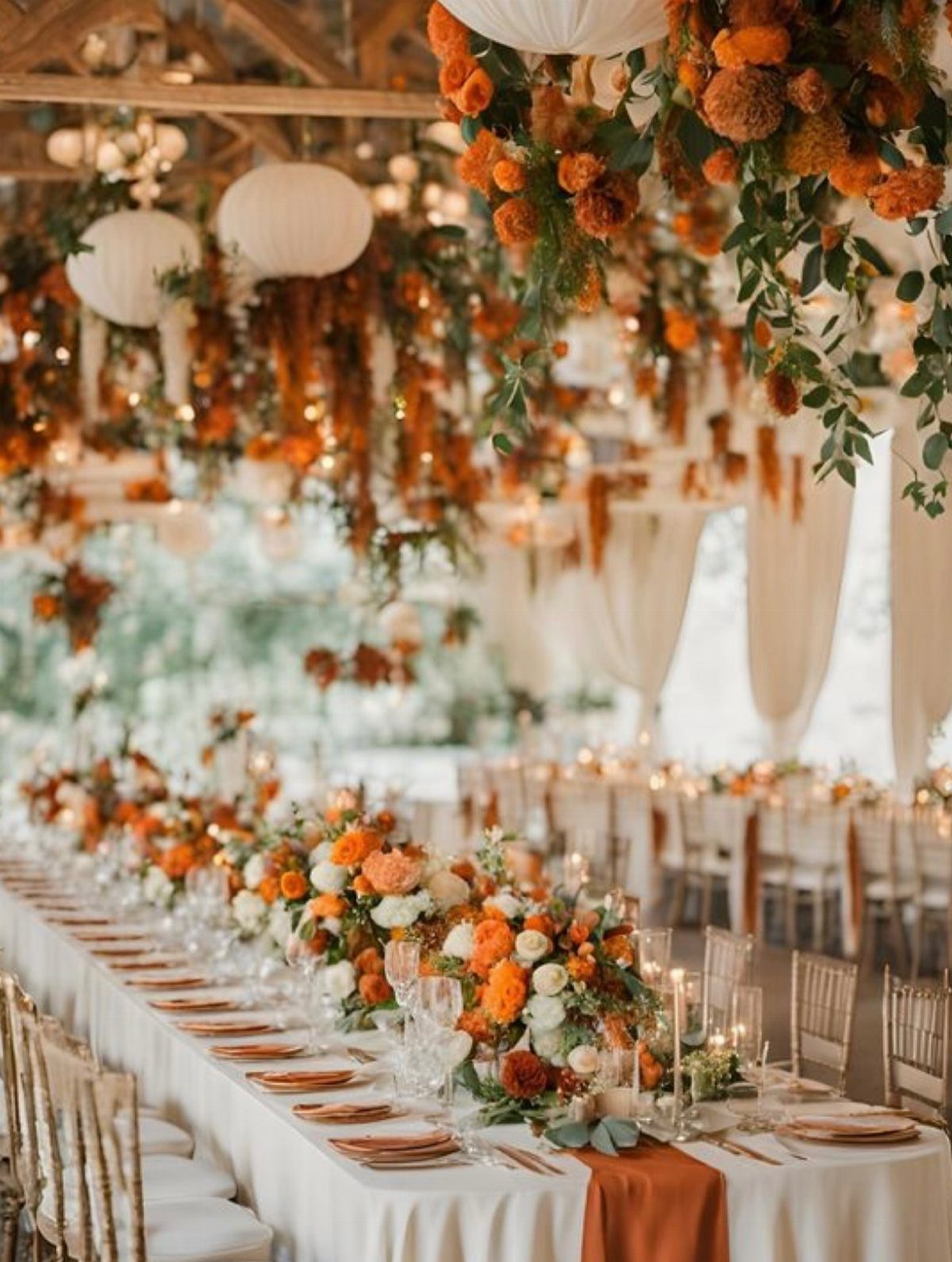
Burnt orange is the color October is known for, and it works across flowers, linens, and decor without feeling too literal. It is warm enough to feel seasonal but neutral enough to pair with almost any other fall shade.
This palette shows up best when you use it in quantity. Run it as a single accent line down the center of the table, or hang installations that repeat the color in clusters rather than scattering it across the room.
Pair it with white linens to keep it clean, or add rust and terracotta if you want a deeper fall look.
4. Burgundy and Green
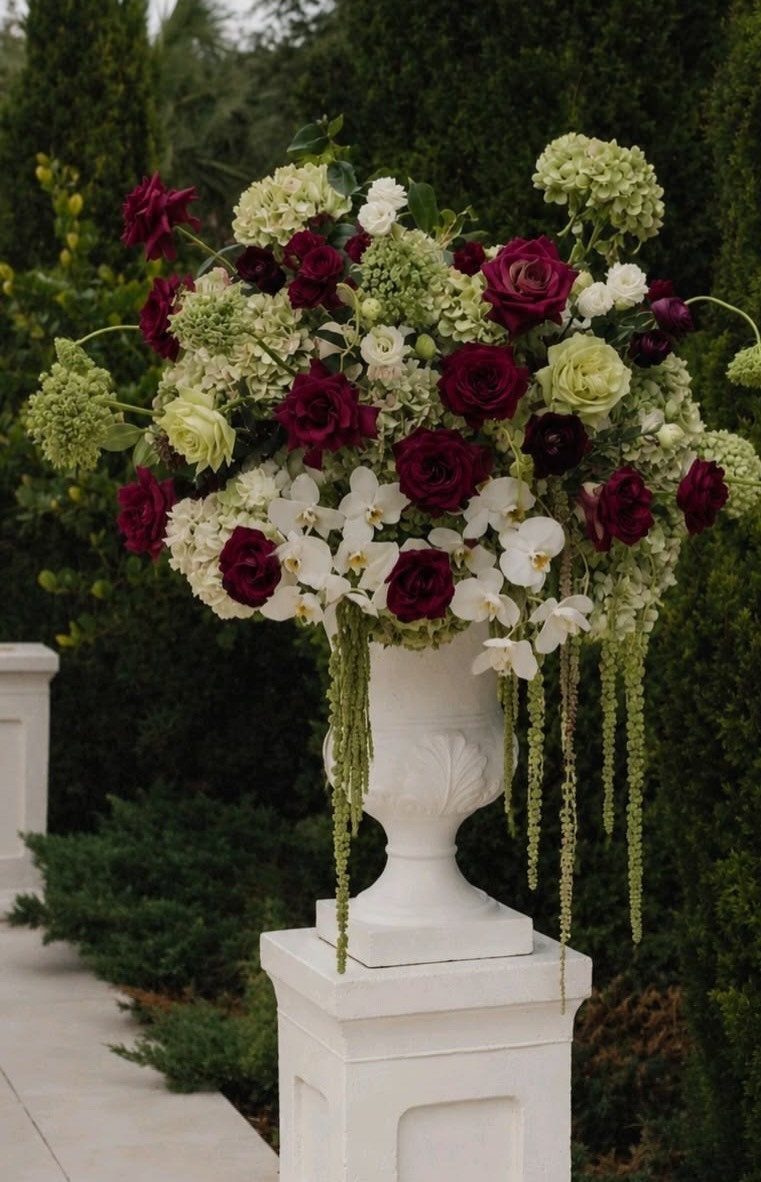
The pairing reads formal but stays soft, and the green keeps it from feeling too heavy. The green keeps the burgundy from feeling too heavy, and the white breaks it up so the arrangement stays balanced.
It works best in tall arrangements where you need both height and mass. Green hydrangeas are budget-friendly filler that add texture without adding cost, and burgundy roses give you the color without needing as many stems.
If you want it softer, swap the burgundy for blush. If you want it richer, use all burgundy and green with no white.
5. Burgundy and Gold Wedding Accents
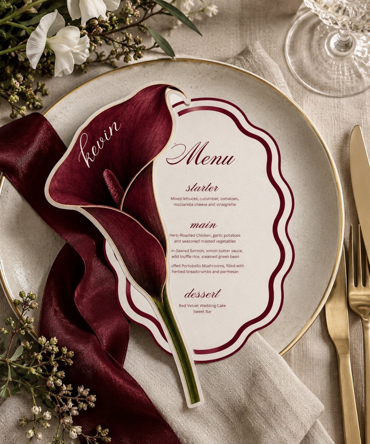
Gold-rimmed plates with burgundy napkins and menu cards bring in a formal, sumptuous feel that suits a plated dinner. The gold acts as the accent rather than a full color, so the burgundy stays the focus.
This setup works on ivory or white linens where the gold rim stands out. A single burgundy calla lily on each plate keeps the florals simple and lets the tableware do the work.
If you want more gold, add gold flatware or gold-edged glassware. If you want it softer, use blush napkins instead of burgundy.
6. Burgundy and Orange Wedding Flowers
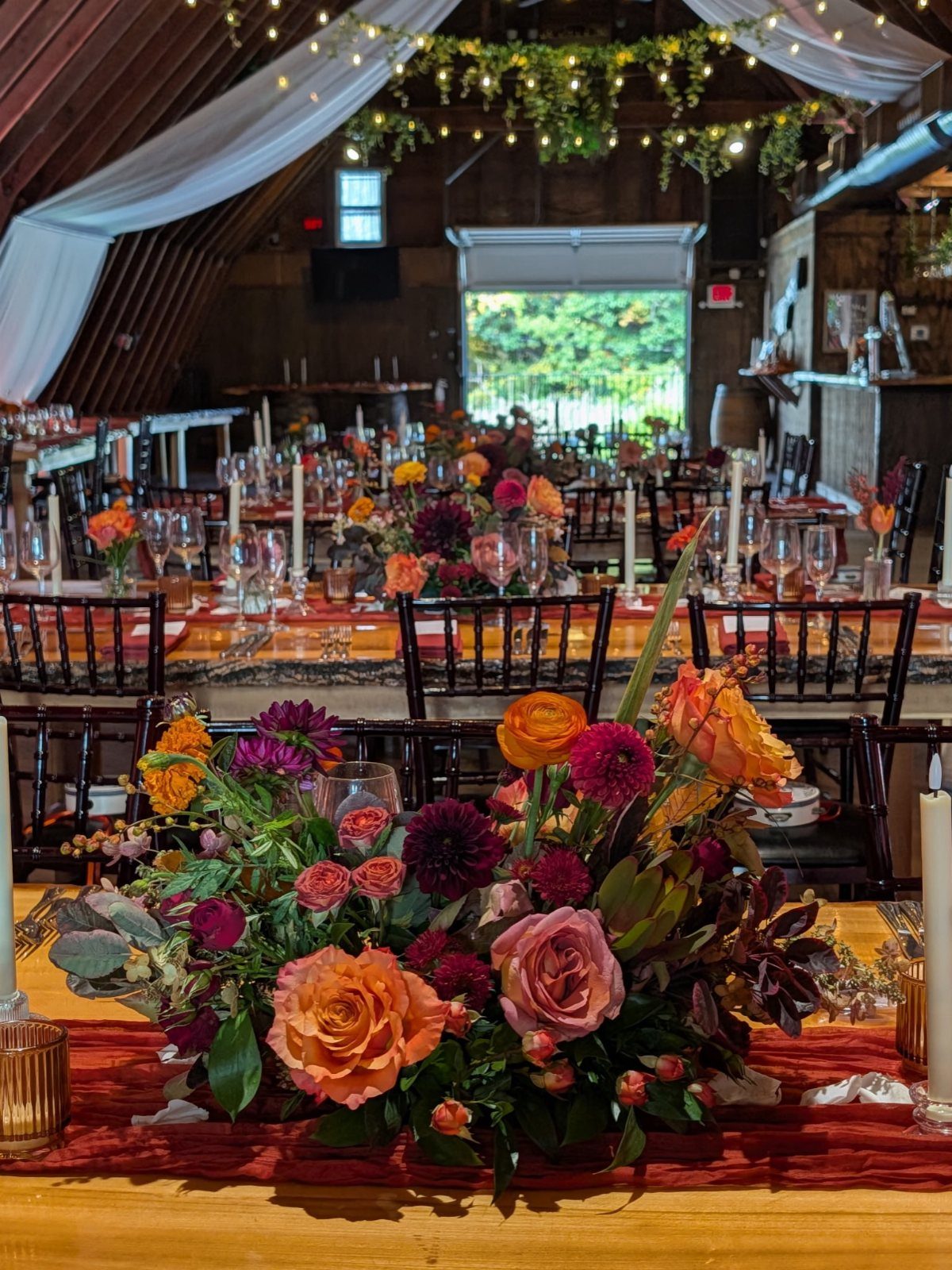
Burgundy and orange together gives you warmth and depth without losing the brightness that makes orange feel like fall.
The 2 colors sit close enough on the color wheel that they blend rather than clash, and roses and dahlias in both shades are easy to find in October.
Wooden tables and greenery ceiling drape keep this palette from feeling too saturated. The wood grounds the colors, and the greenery softens the whole space without adding another strong color.
If you want it richer, add rust or terracotta linens.
7. Emerald, Purple, Teal and Fuchsia Palette
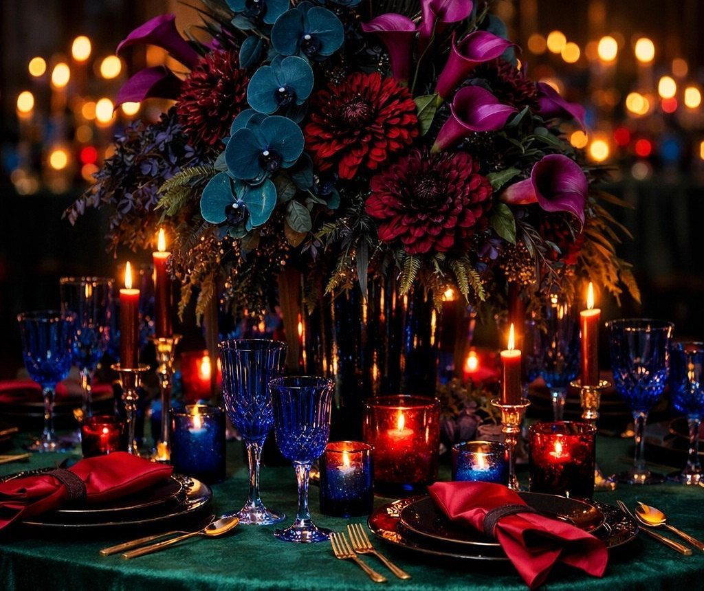
This palette layers jewel tones instead of picking one or two, and the result feels rich without reading as any single season. Emerald, purple, teal and fuchsia all sit at the same intensity, so none of them dominates.
The trick here is keeping the proportions close. If one color takes up twice the space of the others, it stops reading as a mix and starts reading as that color with accents.
Candlelight helps. The warm glow softens the cool tones and keeps the whole table from feeling too saturated.
8. Seasonal Flowers and Deep-Hued Attire
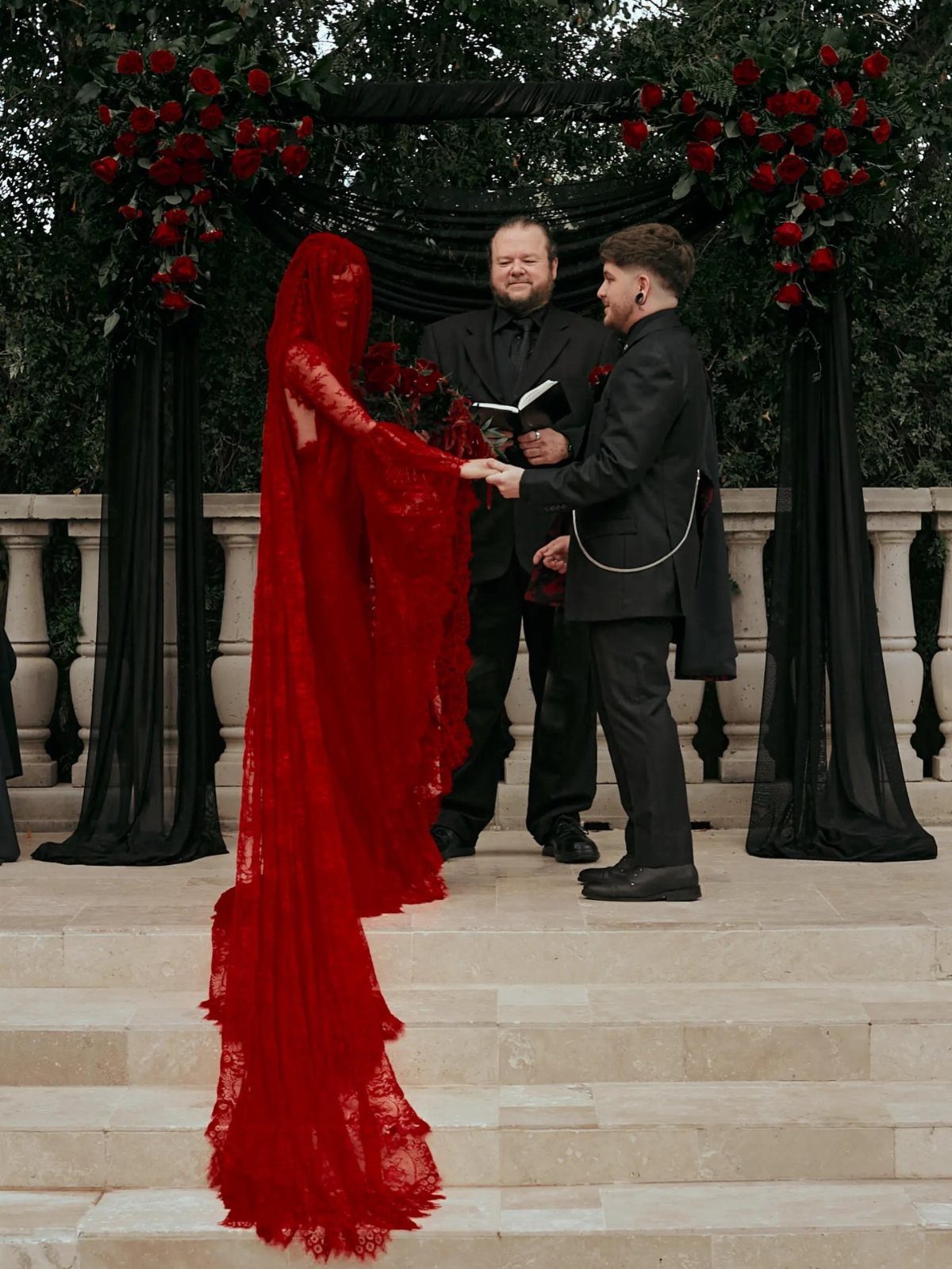
A red gown instead of white or ivory shifts the whole palette toward fall without adding florals or decor. The red becomes the color, and everything else can stay neutral.
This works best with deep reds: burgundy, wine, or true red. Bright or orange-leaning reds feel more summer or holiday than October.
If you want the groom’s attire to match, a burgundy tie or pocket square ties it together without putting both people in the same shade.
9. Blue and Orange Wedding Flowers
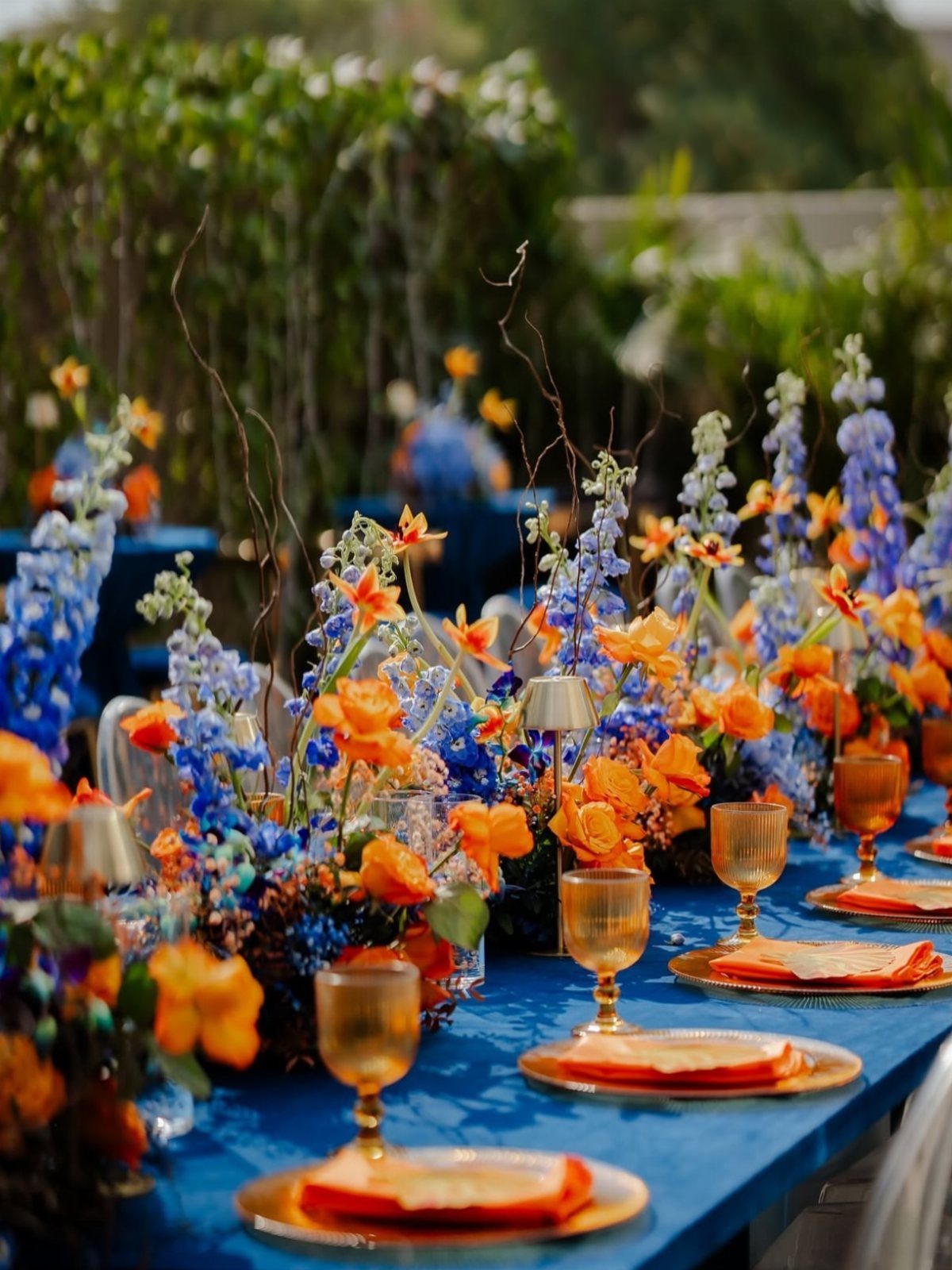
Orange and blue sit opposite each other on the color wheel, so the contrast is strong but balanced. The orange feels like fall, and the blue keeps it from feeling too warm or too expected.
This palette needs both colors in equal weight. If the blue is only in the linens and the orange is everywhere else, it reads as orange with blue accents rather than a true pairing.
Gold flatware and plates bridge the two without adding another strong color.
10. Sunflowers with Hessian and Wood
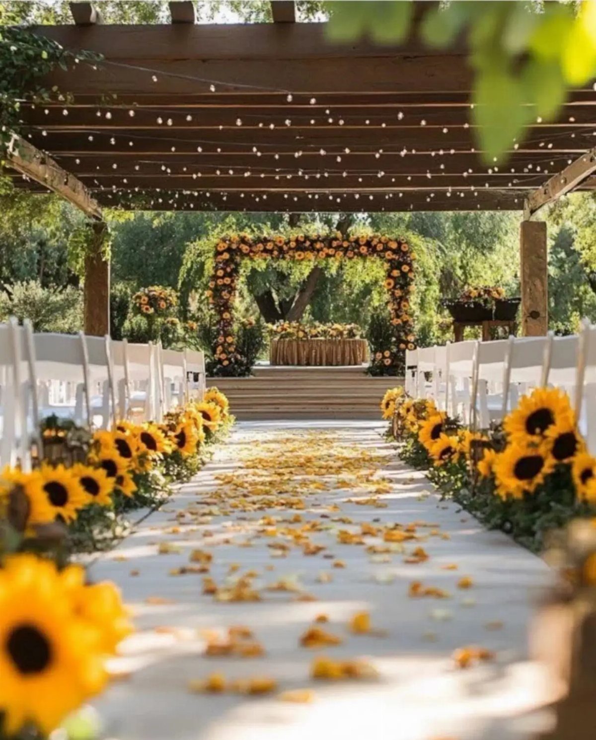
Sunflowers are the most recognizable October flower, and they work as both ceremony and reception decor. The yellow reads as bright and cheerful rather than formal, so this palette suits a daytime or outdoor wedding better than an evening one.
Burlap and wood keep the sunflowers from feeling too polished. The texture grounds the yellow and makes it feel intentional rather than purely decorative.
If you want it softer, pair sunflowers with white flowers instead of using them on their own.
11. Dark Purple and Green
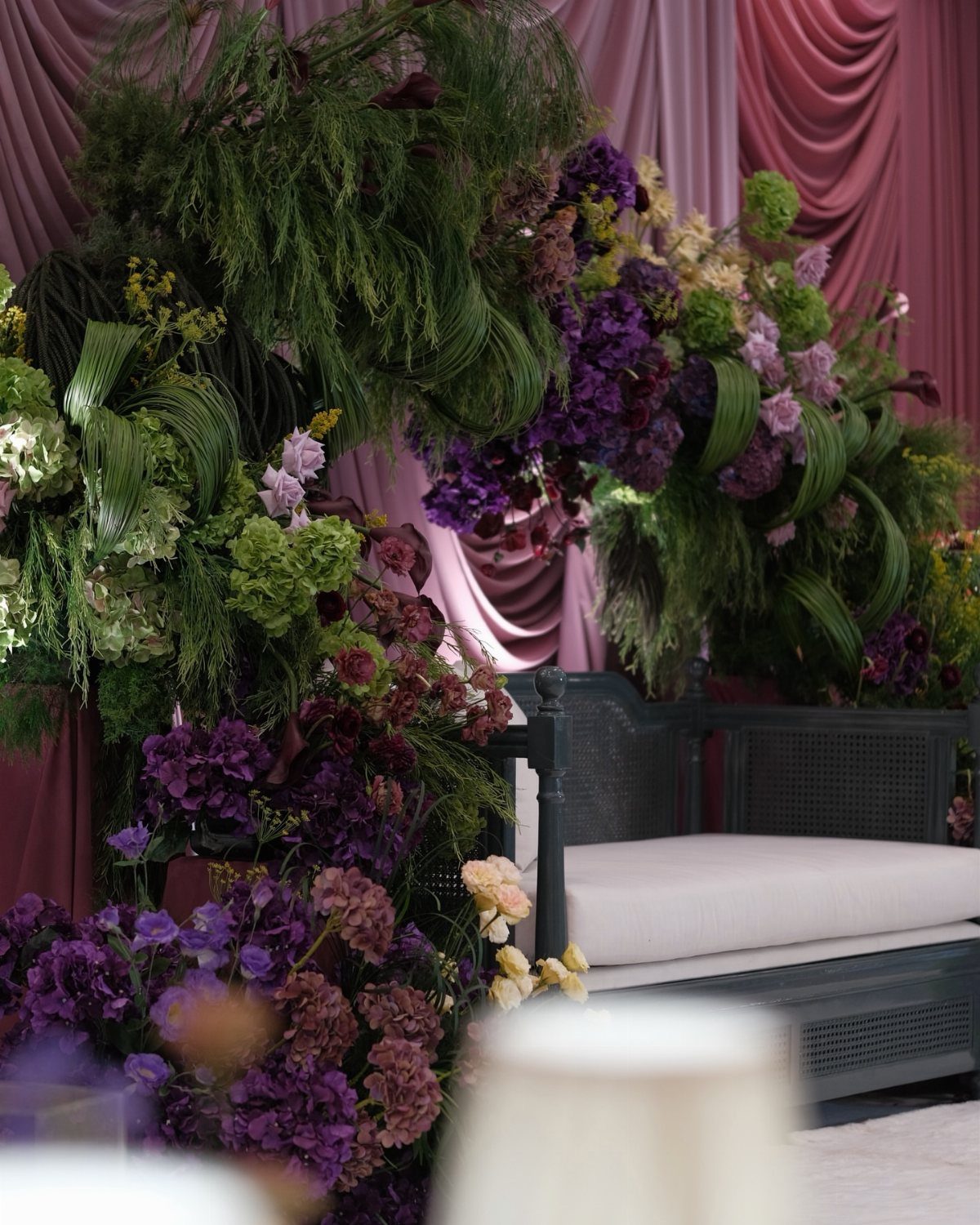
Dark purple and green together feels moody and formal, and the combination holds up in low light better than lighter pastels. The green keeps the purple from reading as too heavy or too jewel-toned.
This palette works when the purple is the main color and the green is the structure. Purple flowers with green foliage give you both without needing to match shades exactly.
If you want it warmer, add gold candleholders or gold-rimmed glassware.
12. Dusky Pink and Pale Green
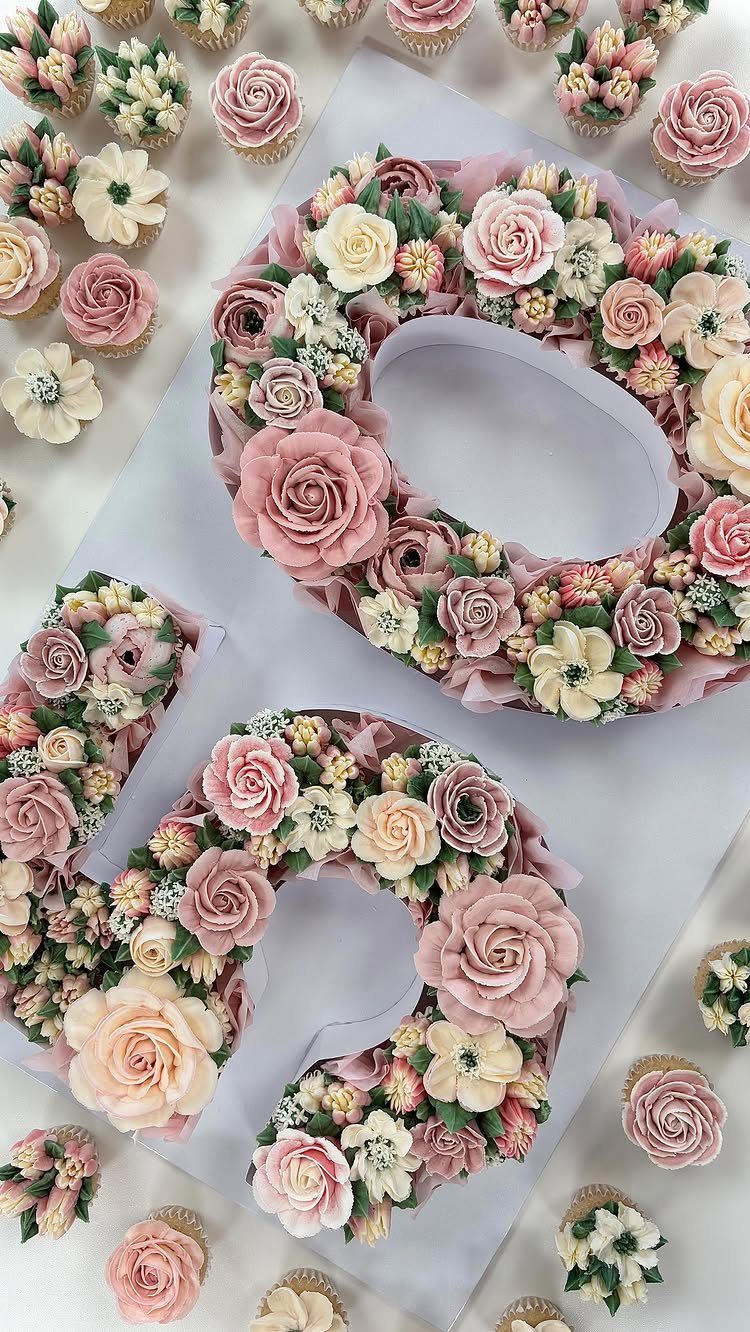
Dusky pink and pale green is softer than most October palettes, and it works for a romantic feel that still nods to the season. The green keeps it grounded, and the pink keeps it from reading as too neutral.
This combination shows up best in flowers and cake rather than across the whole room. The muted tones get lost on large linens or walls, but they hold their own in arrangements and details where the texture is visible.
If you want more contrast, swap the dusky pink for a deeper mauve.
October Season and Palette
October brings peak foliage and mild weather, which puts you right in the middle of natural color at its strongest. The deep reds and golden yellows in the trees give you a starting point that already feels intentional.
October pulls colors from the harvest: warm oranges and golds, deep jewel tones, soft rose and mauve, and the browns and mossy greens of the woods turning.
Traditional autumn shades like burnt orange, red, and yellow work when you want the season to show up clearly in the decor. If you want the season’s warmth dialed back, add peach, blush or champagne to keep the palette light.
Jewel tones carry a richness that is harder to pull off in spring or summer, and the natural color around you makes them feel balanced rather than heavy.
You can lean fully into the season or use it as a backdrop and pick colors that suit the date without matching the foliage.
Using Seasonal Decor and Flowers
Dahlias, marigolds and chrysanthemums bloom in October and give you seasonal color at seasonal prices. Dahlias come in the widest range of shades, from blush to burgundy to burnt orange, and they hold their shape through the day.
Marigolds give you deep yellow and orange without needing much filler, and chrysanthemums add texture in white, burgundy, or rust.
Seasonal foliage and produce can reinforce an autumn theme without adding cost. Fallen leaves, branches, and in-season flowers bring the outdoor color inside, and local venues often have the natural setting already in place.
If you want the palette to feel grounded in October, use flowers and materials that are available now rather than forcing something out of season.
Frequently Asked Questions
What are the trendy colors for weddings in October 2026?
Burgundy paired with blush, white, green, or gold remains a top choice, along with burnt orange, which works across flowers, linens, and decor.
Jewel tones like emerald, purple, teal, and fuchsia layered together give a rich, saturated look that suits the season. Blue and orange offer strong contrast, while dusky pink and pale green deliver a softer romantic feel.
What is the best color for October?
Burnt orange is the color October is known for and pairs easily with other fall shades without feeling too literal.
Burgundy comes next because it feels rich and works across flowers, linens, and table settings. Both colors are warm enough to feel seasonal but versatile enough to anchor a full palette.
What are some unique colors for a fall wedding?
Dark purple and green together create a moody, formal look that holds up in low light better than lighter shades.
Blue and orange give you contrast that feels balanced rather than predictable, and dusky pink with pale green offers a softer romantic palette that still nods to the season.
A bride in deep red or wine pulls the whole room into fall territory before you hang a single garland.
What are the best flowers for an October wedding?
Dahlias give you more color range per stem than most October flowers, from soft peach through true red to near-black burgundy, and they stay crisp from ceremony to last dance.
Marigolds deliver saturated orange and gold with almost no green to edit out, while mums fill space in white, rust, or wine and cost less per head than roses.
All 3 peak in October, so you get full blooms at the lowest price of the year.
What are some budget-friendly October wedding ideas?
Branches, acorns, and листья already covering the ground become free centerpiece material, and flowers that bloom now cost half what you’d pay for the same stem shipped in from somewhere else in June.
Hydrangeas stay green through October and bulk up arrangements for less per stem than most focal flowers, and outdoor venues already have the backdrop without rentals. Burlap and wood keep arrangements grounded without adding expense.